Using complementary colours to enhance your interiors
Today we’re going to look at complementary colours and how to use them in your interiors.
Have you ever walked into a home and thought, wow, this colour scheme is on point, how on earth did they know which colours to choose? If so, then you’ve come to the right place, because today we’re going to take a dip into the world of colour theory and how you can use it to select the right colours for your next design project.
Colour theory
There’s heaps of information on colour theory in the world of art and design – colour theory is a bunch of rules and theories used to define which colour combinations are most pleasing to the eye. We can use key concepts in colour theory to help us select an eye catching colour scheme for any interior.

Wheely good!
The most well-known element of colour theory is the colour wheel: fun fact, Isaac Newton was the first to create a colour wheel in the 1600s, based on an experiment with some sunlight, a prism and a blank wall. He designed the primary colours to be placed opposite their complementary colours in the circle, and all colour wheels since have kept this feature.
What is a complementary colour?
When you look at the colour wheel, complementary colours come in pairs; they are the two colours directly opposite one another on the circle. Simple, right?
The idea is that these two colours used together make each other stand out in a way that’s pleasing to look at, without being too boring, or too intense – it’s like the Goldilocks of colour choice, it’s just right!
Using your new-found knowledge

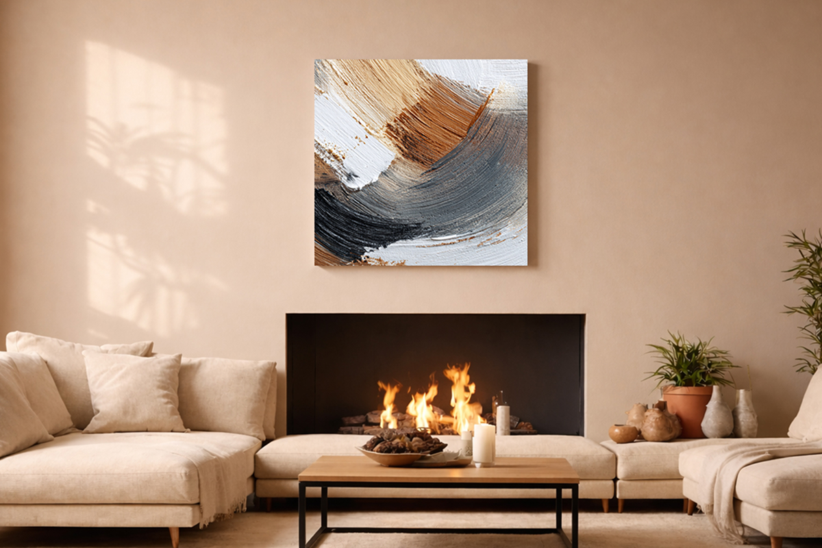
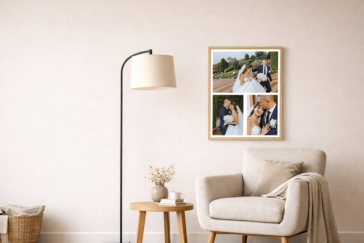
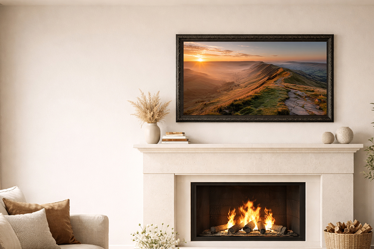
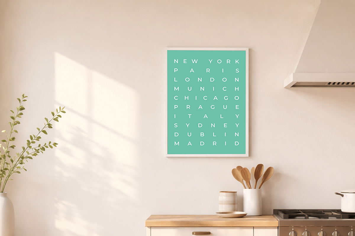
Bring your colour wheel and your wisdom of all things hue to the table when you’re choosing wall art for your space – here are some ideas on creating a coherent interior space:
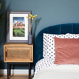
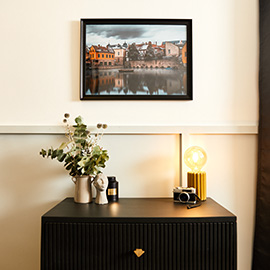
• Choose complementary colours for the wall and the picture frame
• For an eclectic or bold look use two sets of colour pairs
• Enjoy lounging in luxury when you select complementary coloured fabrics for the sofa and cushions
• In a neutral room, complementary colours in your wall art and soft furnishings look divine
Complementary colours aren’t the only colour combinations that work; if you fancy doing more research into the world of colour theory we recommend taking a peek at analogous colours too – these choices are more subtle, but still beautiful when applied to your home decor.
Tags framed wall art, framed pictures, poster prints, framed canvas, framed poster prints, canvas pictures, framed canvas pictures, typography, custom frames, personalised home decor, home decor ideas, colourful home decor