

AI artwork guides / Original matching artwork
AI ARTWORK / YOUR OWN COLLECTION
Create your own matching AI artwork
One style. A world of your own.
A quiet meadow. A vivid Cornish garden. An orchard at blue hour. Learn how to create original artwork from words, then build a collection with its own visual handwriting.

YOUR OWN VISUAL LANGUAGE
Begin with a picture you want to live with.
A matching collection does not need three versions of the same scene. One print can be gentle and pale, another full of confident colour, and a third quieter and darker. What makes them feel related is the way their subjects are drawn: the paint surface, the line, the balance of detail and the recurring shapes.
Our collection starts with an original countryside image made from written instructions. We then carry its visual language into a Cornish garden and an orchard at blue hour. Their subjects and palettes change, but the layered pigment, fine plant drawing and considered composition give them a shared character.
You can begin with a meadow, a garden, a harbour, a still life or an imaginary place. Choose something you enjoy looking at, rather than a subject that happens to be fashionable. A collection becomes more personal when its scenes, colours and small details mean something to you.
The examples on this page are AI-created digital artworks with a painted appearance. They demonstrate a way of building a collection, rather than reproducing an existing artist's paintings.
01 / SET YOUR STYLE
Describe the hand behind the picture.
A subject tells the image generator what to show. A visual recipe tells it how the picture should feel. 'A beautiful meadow painting' leaves many decisions open: it might produce a soft watercolour, a smooth digital illustration or a densely painted oil-style image. Being more specific gives your collection a firmer starting point.
Describe the medium, texture, line quality, level of detail and overall colour family. In our example, matte paint and fine drawn stems matter as much as the flowers themselves. Broad sky passages give the eye a rest from the detailed foreground. A few darker marks make the small details read.
The recipe should be detailed enough to be useful and short enough to reuse. Keep it with the original file and the prompt that created your first artwork. When you make a companion, carry that recipe forward instead of beginning with a completely new description.
Use the controls below to shape your own recipe. You can keep this painted landscape finish or change the medium and line to make something different. The accent colours may vary between pictures: your style does not have to lock every print into one subdued palette.
| Keep recognisable | Allow to change |
|---|---|
| Paint texture, brush marks and drawing quality | Subject, viewpoint and composition |
| Balance of intricate and quiet passages | Season, time of day and colour strength |
| Characteristic plant, tree and building shapes | Specific flowers, buildings or wildlife |
| Thoughtful light-dark balance | Which accent colours lead the picture |
| Signature shape and its relative size, if used | Signature ink colour where contrast needs it |
Your collection recipe
Keep the visual handwriting recognisable. Let the subject and colour mood vary.
02 / MAKE YOUR MARK
Give the collection an original signature.
If you want a signature, design it before you finish the collection. Use your own initials, your own name or an original studio name. A small personal mark can connect the pictures without taking attention away from them. Our example uses JD as a simple initials mark.
Create the mark once on a transparent background, check the lettering carefully and save the actual file. Then place that same asset on each chosen artwork in an image editor. Reusing one saved mark keeps its strokes and spelling consistent. Asking the image generator to redraw a signature in every picture can produce a different mark each time.
Keep the signature small enough to feel like a finishing detail and clear enough to be read close up. Give it a similar relative size and a similar inset from the edges across the collection. If you intend to use canvas, allow space so the signature remains on the front rather than disappearing around the side.
Use darker ink on a light passage, or a lighter version of the same mark on a dark one. The shape should stay recognisable even when its colour changes for contrast. The optional overlay demonstration below places the same saved signature on all three examples; the artwork files are also kept unsigned.
A signature is optional. A strong collection should feel coherent before a mark is added. Keep its description honest: a personal signature on AI-created artwork does not turn it into a hand-painted original.
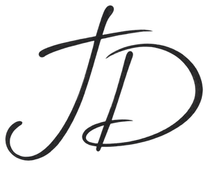
Example initials mark with a transparent background.
Create your personal signature
No reference image needed. Use your own initials, name or original studio name.
Field changes apply only when you choose to replace the prompt. You can edit the complete wording directly.


Signature-placement demonstration. The same saved mark is displayed over each image; the darker artwork uses a lighter ink treatment.
03 / CREATE YOUR BENCHMARK
Start with one original scene.
Create the first picture entirely from your written brief. Think about where the eye should enter the picture, what its quieter areas will be and how its main shapes sit together. A small cottage can be a destination; a curved path can join the foreground and distance; a few plants can create a rhythm.
Our meadow balances closely drawn daisies, grasses and seedheads with broader painted hills and sky. The flowers are not distributed as a repeated pattern. Their changing sizes, stems and overlaps create movement, while the calmer upper part keeps the picture from becoming busy everywhere.
Change the editable subject details to suit the scene you want. Be selective with additions. Every extra animal, building or flower changes the balance, and a longer list does not automatically create a better artwork.
When you find a result you love, save the full original and keep its prompt. This is your benchmark. Check it closely before making a whole set: look for repeated flowers, awkward gates, accidental lettering, strange animal anatomy or small details that become distracting when enlarged.
Create the first original artwork
Start entirely from words. No artwork or photograph upload is required.
Field changes apply only when you choose to replace the prompt. You can edit the complete wording directly.
04 / LET THE COLOUR OPEN UP
A little more colour. The same visual hand.
Our Cornish garden is deliberately bolder than the meadow. Coral-orange flowers, raspberry-pink foxgloves and blue-violet agapanthus sit beside turquoise water and deeper foliage. The colours have different jobs: warm accents lead the eye, cool areas connect the scene and pale walls and flowers provide breathing space.
Colour strength can be a creative choice for each print. A meadow might be full of yellow, a coastal garden might lean towards blue and pink, and an autumn scene might favour copper and olive. Their shared paint handling and drawing habits can still make them feel like part of one collection.
If you use an image reference for a companion, attach your own approved first artwork. Ask the generator to follow its surface, line, level of finish and characteristic shapes. Describe a new subject and a new composition so the result develops the collection rather than simply repeating the first picture.
The prompt below uses that approach. Keep the original recipe, change the subject and choose your colour mood. If you want to work entirely from words, switch the reference setting to the words-only option and repeat the recipe. That route can work well, but it may need more careful comparison because a written description cannot pin down every visual detail.
Make a bolder companion
Use only your own approved benchmark if you choose the reference route.
Field changes apply only when you choose to replace the prompt. You can edit the complete wording directly.
05 / CHANGE THE ATMOSPHERE
Let another picture tell a different story.
A third print can bring a new mood to the wall. In our orchard, a crescent moon and cooler colour move the scene towards evening, while a small resting fox adds a quiet focal point. The familiar flowers, drawn stems and layered paint still connect it with the daylight pictures.
When changing the atmosphere, explain what should remain. Ask for readable colour within the shadows, the same botanical detail and the same paint surface. Avoid adding a new rendering style simply because the scene is darker.
A calm picture can be especially useful beside a bolder one. There is no need for every piece to compete at the same volume. Place the images beside one another and consider the rhythm of the set: where the colour is strongest, where the eye rests and whether one picture overwhelms the others.
You can use this prompt for a woodland, a dusk garden or another imagined place. Change the setting, small focal subject and mood; keep the recipe. If an animal is included, inspect its face, legs, body and tail at full size before choosing the result.
Create a different mood
Change the atmosphere while retaining your collection's visual recipe.
Field changes apply only when you choose to replace the prompt. You can edit the complete wording directly.
06 / LOOK AT THEM TOGETHER
Consistency comes from the details.
Before you print, bring the selected images into one view. Small differences are easier to spot together than when you look at each file separately. Compare the quality of the line, the density of detail, the pigment texture and the way buildings, trees or flowers have been simplified.
You are looking for a family resemblance, rather than identical colour values. A dark evening piece should be darker. A summer garden can be richer. What may need correcting is an unintended change: a smooth vector-like flower, heavy black outlines in one scene, a much hazier sky or a building rendered with photographic precision.
Use a targeted correction prompt for the feature that has drifted. Ask to retain the scene and composition while bringing that feature back towards the benchmark. Corrections may still alter other details, so compare the returned image with the version you already like before replacing it.
A different crop or a different scale of foreground plants may be a deliberate choice. Judge the collection at the size it will hang as well as close up. Some details add character on a small print but become dominant when enlarged. Keep the original versions so you can return to them.
Bring a drifting detail back
Attach your own artwork to adjust and your chosen benchmark. Check the result against the version you already like.
Field changes apply only when you choose to replace the prompt. You can edit the complete wording directly.
FROM DIGITAL ARTWORK TO YOUR WALL
Prepare the files for canvas or poster prints.
Download the highest-quality original file available from your image tool. A screenshot or messaging-app copy can lose useful pixels and colour information. The size of the file in megabytes is not a reliable measure of print detail: pixel dimensions and the chosen physical size need to be considered together.
Check the artwork at full size. Read any wording and inspect the fine details that matter to you. A lovely overall picture may contain small repeated forms or unexpected text that you will notice more on the wall. Keep the unsigned original as well as any final version with your signature.
Match the shape of your artwork to the print. These examples are square. An A-series rectangle has a different proportion, so fitting a square image to it may mean cropping part of the picture or leaving extra space. Check the builder preview and choose dimensions that suit the complete composition.
For a canvas, allow for the front face and edge treatment. Keep the main subject, important flowers and signature comfortably inside the front. Review gallery wrap, mirror sides or another available edge option in the builder. If extra wrap area is needed, preserve the original artwork's front and extend only the surroundings.
Canvas adds the texture and presence of fabric; a matte poster gives a smooth surface for your own frame or mount. Both reproduce a digital image. Printed brush marks can create a painted appearance, but they do not become physically raised paint.
Upload the finished files through our existing print builder, choose the format and size, and check the crop and finish before ordering. Our family-run West Yorkshire workshop checks each supplied image for its chosen print. If you are unsure about a file or a crop, contact us with the original before placing a large order.
| Check | Why it matters |
|---|---|
| Actual pixel dimensions | The same file has less detail per inch as the print gets larger. |
| Shape and crop | A square artwork should not lose an important subject when fitted to a rectangle. |
| Signature and edge space | The mark should remain on the front and clear of a mount opening. |
| Shadow detail | Darker scenes need colour and detail that remain readable. |
| Canvas or paper finish | Choose fabric presence or smooth matte paper to suit the artwork. |
CANVAS & POSTER PRINTS / 3 FOR 2
Choose three you want to live with.
A matching set can include different subjects and colour moods. Our meadow, coastal garden and orchard are separate compositions with a shared finish. You could also build a set around three gardens, three seasons or places that matter to you.
For the wall, consider the frames and arrangement as part of the collection. Similar sizes and a shared frame finish can help varied artworks sit together. If you prefer a looser gallery wall, repeat a few visual choices so the arrangement still has a rhythm.
Our 3 for 2 offer applies to qualifying physical Canvas and Poster prints: the cheapest qualifying base print is free. Frames, hanging kits and other applicable upgrades remain chargeable. Digital files are not items in the offer.
Standard UK delivery is free; any applicable regional or oversize charge is shown before checkout. Choose a format and size in the builder to see the actual price for your print.
THE USEFUL ANSWERS
Questions about creating an AI art collection.
Can I create original AI artwork without uploading a reference image?
Yes. Start with the written scene and visual recipe in the first-artwork prompt. Describe the medium, line, texture, detail and colour mood. You do not need to upload somebody else's painting or a photograph. Once you have your own chosen result, you can use that original as the benchmark for the next picture.
How do I make AI pictures look like one collection?
Keep the way the pictures are made recognisable: the paint surface, drawing quality, simplified shapes, contrast and balance of detail. Reuse the same recipe and, if your tool supports it, your own approved benchmark. Compare the images together and correct features that have drifted. A repeated prompt helps guide consistency; it does not guarantee identical results.
Do all the prints need the same colours?
No. A colourful garden can sit beside a quieter meadow and a blue-hour scene. Keep a related colour family and similar paint handling, then let different accents lead each picture. Pay attention to how strong colours are grouped and how much visual space each artwork gives them.
Can I use these prompts for subjects other than landscapes?
Yes. Change the scene to a garden, harbour, still life or another subject you enjoy. Review the rest of the wording so botanical or countryside instructions do not accidentally add unwanted details. Retain the visual recipe if you want the new picture to stay in the same collection.
Should I upload the first image when making the next one?
If your image tool accepts references, your own approved first artwork can give it more visual information than words alone. Ask it to follow the finish and drawing style while creating a new scene. The editable prompts also include a words-only option, which may need more careful comparison.
Why does the style change between pictures?
An image generator has to interpret the description each time. A new subject, atmosphere or phrase can change how it balances colour and detail. Keep the recipe stable, avoid introducing conflicting medium descriptions and compare the result with your benchmark. Ask for a targeted correction when one feature moves away from the collection.
How do I keep a signature identical across the prints?
Create and approve one transparent signature asset, then reuse that saved asset in an image editor. Keep its shape, relative size and edge inset consistent. A lighter or darker ink version can improve contrast without changing the mark. Repeatedly asking AI to draw the same signature may change its strokes or spelling.
Do I have to add a signature?
No. It is an optional finishing detail. The collection's identity should come from the artwork itself. Use your own initials, name or original studio mark if you choose one, and describe the work honestly as AI-created when that is how it was made.
Will the canvas have raised paint texture?
The painted marks are part of the digital image. A canvas print reproduces them on fabric; it does not add physical layers of gouache or acrylic. The woven surface of canvas gives a different presence from the smooth finish of a matte poster.
How large can I print my AI artwork?
That depends on the actual pixel dimensions, the detail in the file and the physical size you choose. A file-size total or a 300 dpi label alone does not establish print quality. Save the highest-quality native original, inspect it at full size and ask our workshop about the specific file before choosing a large print.
Can I print a square artwork on an A-size poster?
You can choose a rectangular print, but a square artwork and A-series paper have different proportions. Fitting the image may involve cropping or extra space. Review the builder crop carefully, or choose supported square or custom dimensions that keep the complete composition visible.
Can I use 3 for 2 for a matching set?
Yes, for qualifying physical Canvas and Poster prints under the current offer. The cheapest qualifying base print is free; frames, hanging kits and other applicable upgrades remain chargeable. Digital files do not count as print items. Check the basket for the exact offer applied to your choices.
Make a collection that could only be yours.
Choose a scene, give it a visual language and keep the pictures you want to live with. When the artwork is ready, we can turn your finished files into canvas or poster prints.