

Canvas printing.
Made here.
Why we use the Epson SureColor SC-P20000, how ONYX helps manage colour, and what really matters when a photograph becomes a canvas print.
01 / THE PRINTER & MATERIAL
Why we use Epson for canvas printing
A print has to do more than look bright at first glance. A family portrait needs convincing skin tones. A landscape needs a sky that changes gently rather than breaking into visible bands. A black-and-white photograph needs separation between the dark areas, so a coat, a shadow and a background do not become one flat shape.
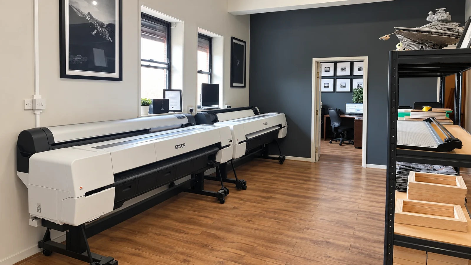
At Your Image 2 Canvas, we use an Epson SureColor SC-P20000 with genuine Epson inks and ONYX RIP software. Our canvas is 230gsm poly-cotton, stretched over solid pine frames. These are deliberate parts of the product: a professional photographic printer, a consistent ink system, a canvas surface we know and a colour-managed route from your image file to the finished print.
Our reason for choosing this combination is straightforward: it gives us the tools to make photographs and artwork look considered on a real wall. The printer is an important investment, but the finished result also depends on the file, the media settings and the decisions made around the print.
02 / THE PRINTER & MATERIAL
What is the Epson SureColor SC-P20000?
The SC-P20000 is a large-format photographic inkjet printer. Epson lists a PrecisionCore MicroTFP printhead, UltraChrome PRO pigment inks, variable-sized droplets with a minimum size of 3.5 picolitres, 700ml cartridges and a maximum printing resolution of 2,400 × 1,200 dpi.
The listed ink set contains Photo Black, Matte Black, Cyan, Light Cyan, Yellow, Vivid Magenta, Vivid Light Magenta, Grey, Light Grey and Dark Grey. This is a photographic system with several lighter and neutral inks, rather than simply four large cartridges.
Those figures describe the machine’s capabilities. They do not establish the quality of an individual image or tell you that every job should use the maximum setting. The useful question is how the printer’s capabilities serve the picture and the material being printed.
Technical reference: Epson Europe SC-P20000 specifications [note]
03 / THE PRINTER & MATERIAL
How the printhead puts an image onto canvas
Epson’s piezoelectric inkjet principle uses a mechanical action to push ink through tiny nozzles. Heat is not used to eject the ink. This is different from a laser printer’s process of fusing toner onto a sheet.
Think of the image as a carefully organised pattern of microscopic deposits. From normal viewing distance, those deposits form continuous-looking colour and tone. The point is control: where ink goes and how it contributes to the image.
For a customer, the mechanism matters because a canvas photograph contains both broad areas and small details. A cheek, a soft sky and a strand of hair ask different things of the printing process. The desired result is an image that holds together at the intended size, with gentle transitions and recognisable detail. Heat-free ink ejection does not mean a complete printer consumes no power or requires no care.
Technical reference: Epson: the mechanical ink-ejection principle [note]
04 / THE PRINTER & MATERIAL
Why the grey inks matter as much as the bright ones
Epson’s P10000/P20000 brochure describes three grey inks alongside the selected Photo Black or Matte Black, giving four levels of black. It also describes the system as nine colours across ten channels. That explains why European specifications listing ten inks and US material referring to nine colours are not necessarily contradictory.
The extra neutral inks support tonal gradation and neutrality. Their value is especially apparent in a photograph with a pale sky, a soft monochrome portrait or a long transition from a lit surface into shadow.
For this article, a rich black should mean a convincing dark area with useful detail around it. Making everything darker would defeat the purpose. Nor does the presence of grey inks guarantee that every black-and-white print will be perfectly neutral under every light: the media, image and colour workflow still matter.
Technical reference: Epson SureColor P10000/P20000 brochure [note]
05 / THE PRINTER & MATERIAL
Large-format printing is about the media as well as the machine
Epson’s loading instructions distinguish the 64-inch roll capacity of the P20000 from the 44-inch P10000. The P20000 accepts compatible rolls on two- or three-inch cores.
That wide roll format gives a print workshop room to arrange images and print substantial work on suitable media. It does not mean a customer can order a 64-inch finished canvas front. The selected product range, margins and material required around the front all affect the usable size.
A stretched canvas is a physical object with sides. A generous roll width helps production, but the artwork still needs the right shape and enough material for finishing. When planning a large piece, use the available product sizes and discuss the actual image rather than treating the printer’s roll capacity as a promise.
Technical reference: Epson: loading roll media [note]
06 / THE PRINTER & MATERIAL
Canvas needs its own media settings
The printer has settings for media thickness, the gap between the head and material, feed adjustment, suction and drying time. Epson’s guide also describes a feed-stabilising sensor and explains how feed adjustment can address horizontal banding.
These controls are relevant because canvas is a textured material rather than a flat office sheet. Reliable movement and suitable head clearance matter alongside colour conversion. An ICC profile cannot physically straighten an incorrectly loaded roll or remove a scuff caused by unsuitable handling.
Our canvas is a poly-cotton material with a coating for printing. The weave contributes to its appearance; the coating and settings determine how the ink behaves on that surface. A claim that a printer supports canvas is only the beginning. The particular material has to be treated as part of the printing setup.
Technical reference: Epson SC-P20000/P10000 user guide, media settings and feed adjustment [note]
07 / COLOUR MANAGEMENT
What does ONYX RIP software actually do?
RIP means raster image processor. ONYX takes an image together with its job settings and processes it into the raster data sent to the printer. The job includes decisions about how the image will be produced, rather than being just an uploaded photograph.
ONYX documentation describes Quick Sets as groups of settings used to create jobs efficiently. Individual settings can then be adjusted where necessary. This is useful when a workshop needs a repeatable starting point while still allowing a particular image to receive attention.
For us, ONYX is part of the production workflow alongside the Epson printer. It is not a filter that makes every photograph more colourful, and it cannot restore detail that was never in the original file. Its value is controlled processing: turning the chosen file and printing conditions into a job the printer can reproduce.
Technical reference: ONYX: how a file becomes a print job [note]
08 / COLOUR MANAGEMENT
The input profile: understanding the colours in your file
An input profile tells the colour workflow how to interpret the source image. ONYX provides input-profile controls for different kinds of RGB and CMYK image and vector data.
A colour value is not a complete description on its own. The intended colour space gives that value meaning. If a file’s colour information is misinterpreted, simply increasing saturation later does not solve the underlying problem.
For customers, the practical advice is to keep the original export and its colour information where possible. If an artist or photographer has prepared the file for you, retain that version rather than making a screenshot of it. If you are unsure what profile or export setting to use, ask before converting the image yourself. We can discuss the file you have; you do not need to guess at a technical setting to place an order.
Technical reference: ONYX: input profiles [note]
09 / COLOUR MANAGEMENT
The output profile: matching the printer, ink and surface
An output profile describes how the chosen printer, ink and media options reproduce colour. ONYX identifies the output profile as the part of the workflow that compensates for those characteristics.
In practical terms, a canvas profile and a photographic-paper profile are not interchangeable labels. Changing the surface changes the printing conditions. A profile suitable for one combination may not describe another accurately.
Our use of ONYX includes a profile matched to the print material and workflow. That is a more meaningful approach than assuming that the same file can be sent to every surface with the same settings. The aim is to make a good interpretation of the photograph on the material you choose. A profile helps colour conversion; it cannot make a textured canvas behave like a luminous screen or a glossy sheet.
Technical reference: ONYX: output profiles [note]
10 / COLOUR MANAGEMENT
What is an ICC profile, in plain language?
An ICC profile is a standardised way to describe colour characteristics so that different devices and applications can exchange colour information. It provides a mapping rather than an instruction to make an image automatically look better.
A useful analogy is a translation guide. The input side describes the file’s colours; the output side describes the available reproduction conditions. The colour-management system uses those descriptions to make the conversion.
This distinction is worth understanding if you are printing your own artwork. “Colour managed” means that colour interpretation is addressed deliberately. It does not mean the printer can produce every possible colour, or that a profile is a universal certificate of quality. You still need an appropriate file, a suitable surface and sensible expectations about the finished object.
Technical reference: International Color Consortium: introduction to profiles [note]
11 / COLOUR MANAGEMENT
Why more ink does not automatically mean better colour
ONYX’s profiling guide separates individual-channel ink restrictions from total ink limits. The first concerns how much usable ink a coating can accommodate from a channel; the second deals with combinations of channels.
Too much ink can create problems such as bleeding, mottling, smudging or an uneven surface appearance. A darker patch is not an improvement if its detail disappears or the material cannot accept the ink cleanly.
The profiling workflow establishes ink restrictions, calibration, combined ink limits and the ICC profile in a deliberate sequence. Printed patches and measurements help describe the combination being used. This is why a carefully controlled print can be both vivid and restrained: colour strength needs to sit within what the material can reproduce successfully. It is not a contest to apply the largest possible quantity of ink.
Technical reference: ONYX: media profiling and ink limits [note]
12 / COLOUR MANAGEMENT
Calibration and profiling are related, but different
Calibration establishes a target behaviour for the printer and media. Profiling describes how that printing condition reproduces colour. ONYX explains recalibration as a way to return output towards its target when environmental, hardware or ink conditions change.
The important point is that a colour workflow has a baseline. A file that prints well today should not be judged solely by whether the same settings have been selected again; the physical printing condition matters too.
This is a general explanation of the ONYX process, rather than a claim about a particular measurement schedule in our workshop. We do not attach an invented calibration frequency or certification badge to the product. Consistency should come from the way the equipment, material and output are managed, supported by checks appropriate to the work.
Technical reference: ONYX: calibration and recalibration [note]
13 / COLOUR MANAGEMENT
What happens to a colour the canvas cannot reproduce?
A rendering intent sets the approach used when converting between colour ranges. ONYX describes perceptual rendering as preserving visual relationships through adjustments, while relative colorimetric rendering aims to retain colours within the output range and maps those outside it.
Neither is a universal “best colour” switch. A photograph with gentle transitions and an illustration with a few strong flat colours can present different challenges. Black point compensation can also help preserve shadow relationships during suitable conversions.
For a customer, the important outcome is a sensible interpretation of the picture. We want a sunset to retain its feeling and a portrait to retain believable colour, rather than promising that every source value is reproduced unchanged. The intent, profile and available print range work together. They do not expand the physical capabilities of the material indefinitely.
Technical reference: ONYX: rendering intents [note]
14 / COLOUR MANAGEMENT
Why a canvas may look different from your screen
A display and a print can reproduce different ranges of colour. The International Color Consortium calls that range a gamut. Colour management addresses the conversion between those ranges; it cannot remove their physical differences.
A screen emits light, while a print is viewed by reflected light. A bright display can therefore make an image appear more luminous than the printed version. The room’s illumination and the canvas surface also influence what you see.
This is particularly useful to remember with intense blues, luminous greens, deep shadows and pale neutral colours. “True colour” should not be taken to mean an exact match to every phone at every brightness setting. A realistic goal is a controlled, convincing print under normal viewing conditions, with the important colour relationships and detail preserved as well as the process allows.
Technical reference: International Color Consortium: colour-management questions [note]
15 / THE IMAGE & FINISHED PRINT
A better way to judge an image before printing
The ICC distinguishes display calibration from profiling: calibration sets a desired display behaviour, while a profile communicates its colour characteristics. Both contribute to a useful colour-managed screen workflow.
If you already edit photographs or artwork, an appropriately calibrated and profiled display can improve your decisions. If you are ordering a family picture from your phone, you do not need to become a colour specialist. Avoid judging solely from an unusually bright screen, a night-colour mode or a heavily filtered preview.
Look first at the photograph itself. Is the face sharp? Is the important part still visible after the intended crop? Does the image contain the expression and moment you want? These are decisions no printer specification can make for you. If the picture looks very dark or its colours are unusually critical, talk to us before choosing a large print.
Technical reference: International Color Consortium: display calibration [note]
16 / THE IMAGE & FINISHED PRINT
Printer dpi is not the same as photograph ppi
ONYX separates print-mode resolution and dot pattern from the source image’s pixel dimensions. Printer dpi describes output dots; image ppi describes how many source pixels occupy an inch at a chosen print size.
A 6,000 × 4,000-pixel file printed at 30 × 20 inches contains 200 source pixels per inch before any crop. At 20 × 13⅓ inches, the same file contains 300. The printer’s much higher dot figure does not mean you need that many image pixels per inch.
These are arithmetic examples, not minimum-quality promises. Focus, compression, subject detail, crop and viewing distance also affect the result. Changing a file’s dpi label without adding genuine image information does not sharpen a blurred face. Keep the best original file and choose a size that suits it.
Technical reference: ONYX: printer, media and source-image information [note]
17 / THE IMAGE & FINISHED PRINT
What nozzle checks and alignment contribute
Epson’s guidance links graininess, blurred output, misaligned vertical lines and horizontal bands with possible alignment problems. It advises a nozzle check before alignment, and notes that alignment depends on the loaded media.
A nozzle check and an image test serve different purposes. The nozzle pattern helps reveal missing jets; an image helps assess the way photographs are reproduced. A pleasing photograph is not a substitute for checking the printer’s condition.
For customers, maintenance matters because print quality is not permanently secured on the day a machine is bought. The equipment needs appropriate care and settings throughout its use. If an output problem occurs, its cause needs to be identified rather than covered by stronger contrast or saturation. The skill lies in maintaining a suitable printing condition as well as preparing the image.
Technical reference: Epson: print-head alignment [note]
18 / THE IMAGE & FINISHED PRINT
What a colour-and-tone test image can show
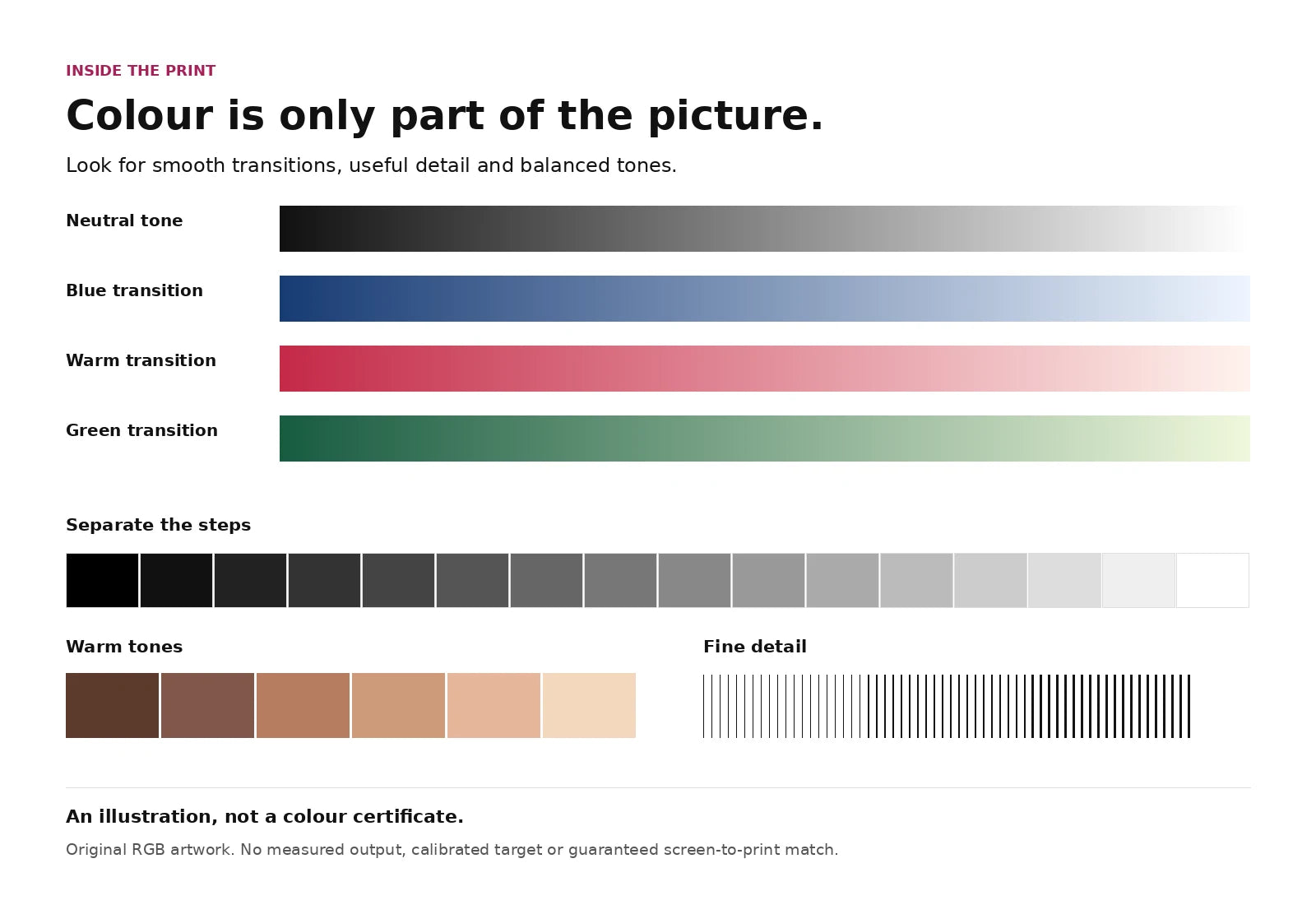
Our illustration below contains colour ramps, a neutral grey ramp, pale and dark steps, warm tones and fine lines. Each part invites a different observation: are transitions smooth, are nearby steps distinguishable, and do fine marks remain separate?
On an actual print, these patterns can help reveal issues that are easy to overlook in one attractive photograph. A smooth blue ramp makes a tonal jump more apparent than a busy scene. A neutral ramp encourages you to notice an unwanted colour cast. Small pale and dark steps invite a closer look at highlight and shadow separation.
This is an original explanatory illustration, not a calibrated target, an ONYX screenshot or a measured result from our printer. Its RGB patches are not certified colour references. Viewing it online cannot verify our colour accuracy, and the image should not be used to diagnose a display or build an ICC profile.
19 / THE IMAGE & FINISHED PRINT
When colour needs measurement rather than a visual impression
ONYX describes tools for measuring profile performance and checking consistency against reference conditions. A measured comparison can express colour difference using delta E: a number indicating the difference between colours under a defined method.
That kind of verification is different from saying a chart “looks vibrant”. It requires actual measurements, a defined comparison and an appropriate viewing or testing condition.
This article does not claim that YI2C uses every ONYX option, holds G7 or FOGRA certification, or meets a particular delta-E tolerance. Those would need evidence about our installed system and measured output. If you have colour-critical artwork or a brand colour to reproduce, tell us what matters before ordering. A discussion about an appropriate proof or sample is more useful than an unconditional promise based on a printer’s name.
Technical reference: ONYX: colour management and measured verification [note]
20 / THE IMAGE & FINISHED PRINT
Pigment inks, longevity and the meaning of archival
Epson’s published longevity figures are based on accelerated tests using specified media and display conditions. Its current guidance makes clear that actual stability depends on the material, image, light, humidity and atmosphere; it does not guarantee print longevity.
We use genuine Epson pigment inks, but we do not turn laboratory figures for particular protected prints into a lifespan guarantee for an unglazed canvas. The whole finished object and where it is displayed matter.
Treat a canvas as an indoor artwork. Avoid prolonged direct sunlight, damp locations and abrasive cleaning. “Archival ink” is not a promise that every canvas is waterproof, fade-proof or unchanged forever. If a print is important enough to preserve carefully, choose its location with the same care as its image. The honest value is a well-made product and appropriate materials, with sensible advice about looking after it.
Technical reference: Epson: print permanence and its conditions [note]
21 / THE IMAGE & FINISHED PRINT
Printing is one part of making the finished canvas
Once a picture is on the material, it still has to become a finished object. The front composition, side treatment and stretching determine how that photograph sits on the frame. At YI2C we use solid pine stretcher frames and do not add varnish to our canvas prints.
Consider the edges before ordering. A face near the boundary of the file may be too close to the side of a stretched canvas. Depending on the available creator options, a mirrored or plain side can help retain the front composition. Check the preview and ask if an important detail is close to the edge.
The canvas weave gives the image a fabric presence. Matte poster paper gives a smoother presentation for a frame of your own; YI2C posters are supplied unframed. These are different ways to enjoy the same photograph, so the choice should follow the image, wall position and finish you prefer.
22 / THE IMAGE & FINISHED PRINT
How to give your photograph the best start
Upload or send the best original file you have, rather than a screenshot of a preview. A photograph saved through a messaging service may be a smaller version of the camera original. When possible, return to the original camera file or the photographer’s supplied download.
Look closely at eyes, faces, lettering and important details. Choose the shape and size with the crop in mind. A sharp small image and a large blurred image are different problems; file size alone does not settle whether either will work well.
For artists, keep a properly prepared export with its colour information and tell us if the work depends on subtle neutral tones or a particular colour. For family photographs, tell us which moment or detail matters most. You bring the image; we bring the printing process. Together, those decisions give the finished canvas its purpose.
THE USEFUL ANSWERS
Canvas printing questions.
Which Epson printer do you use for canvas printing?
We use the Epson SureColor SC-P20000 with genuine Epson inks and ONYX RIP software. Our canvas is 230gsm poly-cotton on solid pine stretcher frames.
Is the SC-P20000 the same as the F20000?
No. This article concerns the photographic SureColor SC-P20000. Do not confuse its model name with Epson’s separate F-series machines. Always check the full model designation.
Source note →Is it a nine-colour or ten-colour printer?
Epson lists ten inks including Photo Black and Matte Black. Its US brochure describes nine colours across ten channels, using the appropriate black for the media.
Source note →Does it print straight onto canvas?
The image is printed onto the suitable coated canvas material before finishing and stretching. It is not a paper photograph glued onto the canvas.
What does ONYX add to the process?
It combines the image and job settings, processes the data and sends the prepared raster output to the printer. We use it as part of a controlled production workflow.
Source note →What is a canvas ICC profile?
It describes the colour behaviour of a particular output combination. A profile for another surface or printer may not describe the canvas setup correctly.
Source note →Does ONYX automatically fix poor photographs?
No. A controlled print workflow cannot recover missing focus or genuine detail absent from the source. Send the best original and ask about size if you are unsure.
Why not use maximum ink for stronger colours?
The material can accept only a suitable amount cleanly. Channel restrictions and combined ink limits help avoid defects caused by excess ink.
Source note →Will my canvas match my phone exactly?
An exact match to every phone is not realistic. Displays and prints have different colour ranges and viewing conditions. Brightness and room light influence their appearance.
Source note →Do black-and-white photos work on canvas?
Yes. Think about the separation of pale, mid-tone and dark areas as well as the subject. A well-chosen monochrome photograph can suit the fabric surface beautifully.
Do I need a 2,400 dpi photograph?
No. Image pixels and printer dots are different measurements. Choose a size using the original pixel dimensions, crop and visible detail rather than the printer’s dot figure.
Source note →Can you print a low-resolution image very large?
The printing equipment cannot remove every limitation of a small file. Some subjects are more forgiving than others. Share the original before committing to a large size.
Should I convert my photo to CMYK?
Do not make an arbitrary conversion. Keep the original export and its colour information; if you have a professionally prepared file, ask about the intended workflow before changing it.
Source note →Does a test image prove perfect colour?
No. The illustration here explains visual checks. A measured colour claim requires actual printed output, measurements and a defined reference; a web image cannot establish it.
Source note →How long will a pigment-ink canvas last?
There is no universal lifespan. Media and display conditions matter. Manufacturer test figures for specified protected prints should not become an unconditional guarantee for every canvas.
Source note →Are canvas prints waterproof or suitable outdoors?
We offer canvas as indoor wall art, not an outdoor or waterproof product. Avoid damp display locations and harsh cleaning. Contact us about the setting if you are unsure.
Do you varnish your canvas prints?
No. We do not add varnish. Our canvas finish comes from the printing material and ink, without claiming a separate protective coating.
Is canvas better than a poster print?
Choose canvas for a fabric surface and stretched presentation, or matte poster paper for a smoother print in your own frame. Posters are supplied unframed.
Can I reproduce original artwork on canvas?
Yes, using a suitable digital file. Tell us about colour-critical details and consider the capture quality, intended crop and size. Printing a reproduction does not turn it into a hand-painted original.
What should I check before ordering?
Check the original file, crop, face sharpness, important details, chosen size and side treatment. Review the creator preview and ask for advice if anything important sits near an edge.
YOUR IMAGE. OUR PRINTING.
Give your photograph a place.
Choose the surface and size that suit your image, or ask us about the detail that matters before you order.
Sources & further reading.
Manufacturer and colour-management documentation checked for this article on 13 October 2026. Version-specific ONYX documentation explains general concepts; it does not identify the version or optional features installed in our workshop.
- Epson Europe SC-P20000 specifications
- Epson SureColor P10000/P20000 brochure
- Epson: the mechanical ink-ejection principle
- Epson SC-P20000/P10000 user guide, media settings and feed adjustment
- Epson: loading roll media
- Epson: nozzle checks
- Epson: print-head alignment
- ONYX: how a file becomes a print job
- ONYX: profile setup
- ONYX: input profiles
- ONYX: output profiles
- ONYX: media profiling and ink limits
- ONYX: calibration and recalibration
- ONYX: rendering intents
- International Color Consortium: colour-management questions
- International Color Consortium: display calibration
- ONYX: printer, media and source-image information
- Epson: print permanence and its conditions
- ONYX: colour management and measured verification
- International Color Consortium: introduction to profiles