
Using The Colour Blue In Interior Design
Understanding colour is crucial when considering a new decorating project, and that’s particularly true when using blue in interior design, because it can easily make a space feel cold.
However, if you follow our simple guidelines, there’s no reason why you can’t make blue work for you!
Choosing the correct shade of blue
Effective use of blue in interior design is a balancing act between the shade and tonal properties of the colour you choose, the room you’re using it in, and the amount and quality of light the space receives. For example, a deep, rich blue would work great on a feature wall or as soft furnishings in a room that receives plenty of daylight, but in a shady room it’ll feel cold and stark.
The deeper shades of blue that remind us of the depths of the ocean are always better used sparingly, but if you do it correctly and balance them with earthy browns they can lift a large space like a sitting room to a level of real elegance.
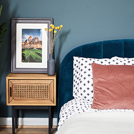
Warmer or lighter shades of blue work great almost anywhere, but they’re particularly good in children’s bedrooms and office spaces because they’re so calming. Again, make sure there’s plenty of light, and accent them with warmer colours for balance and you won’t go wrong.
Blue in the bathroom
When we think of using blue in our home, our first thought is usually of the bathroom… and with good reason! Being the colour of the sky and ocean, blue just feels right for the space, and it’s hard to go wrong. With bathrooms generally being relatively small, it’s possible to get away with quite bold use of blue – perhaps a mosaic of deeper shades accented with lighter greeny blues. You can be brave and paint the walls with deep sea blues without it feeling oppressive because we never spend more than an hour or so in the room, so don’t be afraid to be creative!
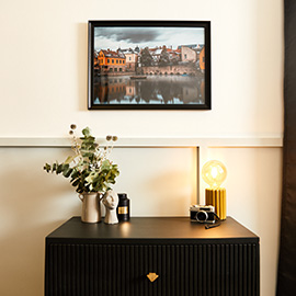
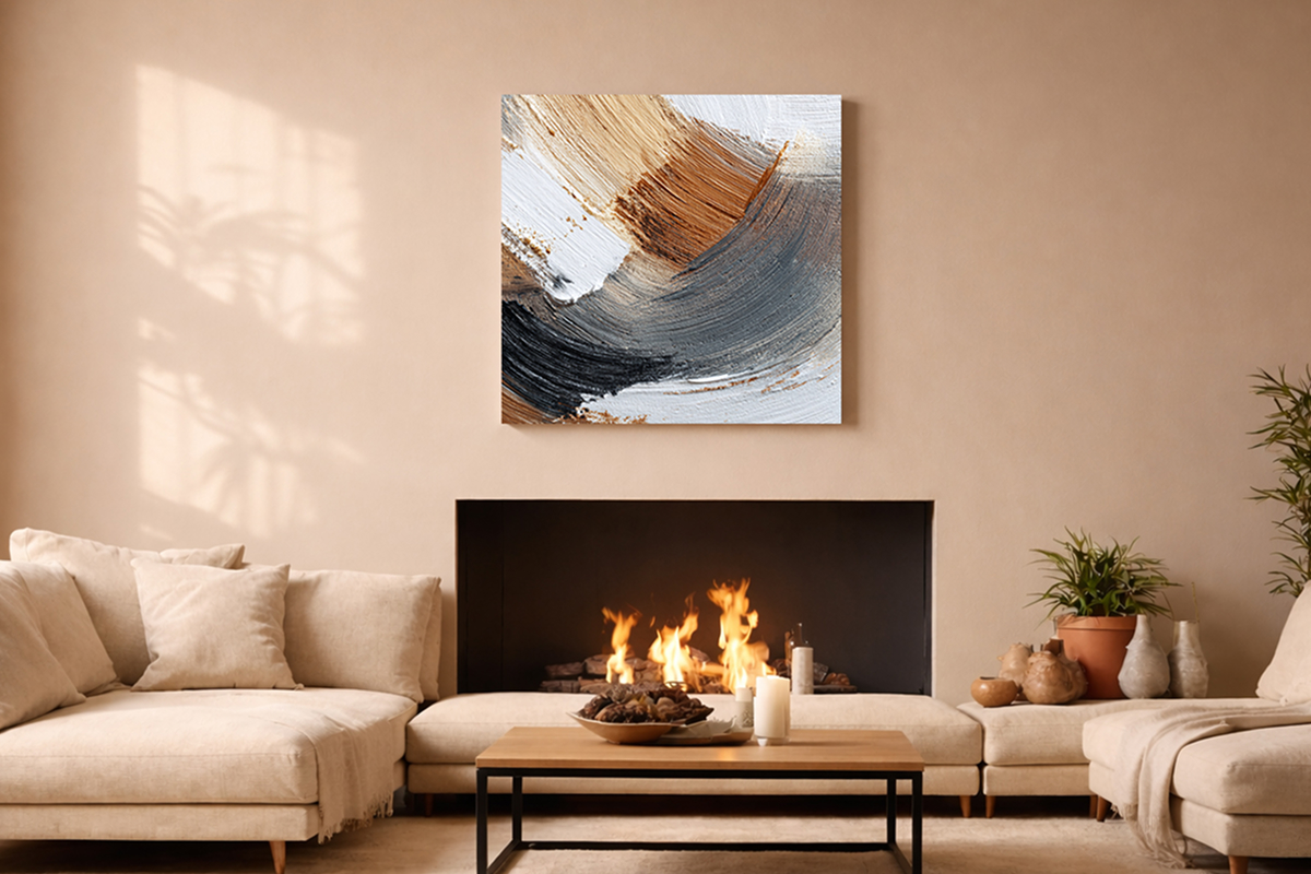
As you can see, there’s no need to be afraid of using blue, as long as you’re careful and understand how the various tones affect a space. We love light blue rooms with bolder blue soft furnishings and big abstract canvas prints adorning the walls – it looks so classy and elegant! You don’t, however, have to take out word for it – grab some colour charts and get some blue in your interior design projects!
Tags blue canvas, design, photo on canvas