Using The Colour Green In Interior Design
Using green in interior design is the perfect way to create a relaxed and peaceful living space. Psychologically, we’re hardwired to respond favourably to green because it’s the colour of nature, and studies have shown that even looking at green grass changes our brainwaves for the better.
If that’s not enough to persuade you to choose green, let us have a go at convincing you further!
Choosing the correct shade of green for your interior
There are many shades of green, and they’re not all relaxing. For example, a lime green bedroom isn’t likely to encourage a great night’s sleep, is it? However, it might work as an accent colour in a kitchen to add a little zing.
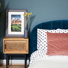
In the bedroom, earthy greens work especially well and go a long way to creating a nurturing environment for sleeping. Stick to light and mid-shade greens because dark green can be a little suffocating – although a combination or lighter greens and a darker green can work if it’s not overdone.
In your main living area, you have more leeway to experiment. Go for muted greens for a relaxing space, or you can choose a lighter more vibrant green if you want to create a more energised room. Don’t go crazy though, because nobody wants to live in a children’s soft play area!
Using green with other colours
The beauty of using green in interior design is how readily it goes with other colours. As always, natural colours work great with a neutral base – for example, warm, earthy greens go perfectly with light browns and magnolia.
If you have a small room, a dark rich fern green married with light orange and grey will make it feel spacious and vibrant – this is a brilliant combination for a small home office.
Perhaps you’re looking for something to enhance your vintage furniture? Well, a medium olive and bronze combo is classy and timeless, but you could also try citrine green or lawnmover green with an off-white.
Green is such a forgiving colour and it offers so many possibilities that we hope you’re willing to add a splash of it to your life. After all, what other colour has shades that remind you of a walk through the forest and a children’s birthday party!? Yes, using green in interior design is a masterstroke that’s very hard to get wrong, so give it a go and let us know how it goes!
