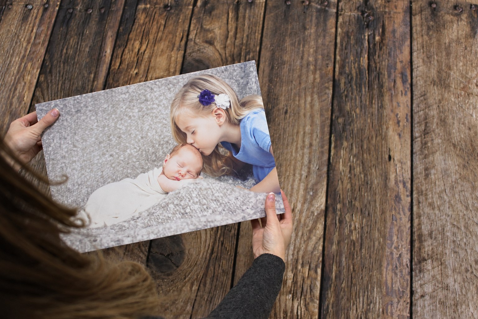
A view you look forward to seeing when the curtains open. A photograph from the trip you still talk about. One confident piece of colour that makes the rest of the room feel considered. Bedroom wall art can do any of those things, and the best starting point is the room you actually have.
You might already own the right picture. Before searching for something new, look through the photographs you have kept: the quiet end of a beach, the garden in early light, a wedding moment with room around the people. A personal image can belong here because of what it means, as well as how it looks.
This guide will help you choose the scene, work out where to put it, and prepare a file for a canvas print or photo poster. There are eight directions to explore, editable prompts for creating and refining artwork, and practical ways to keep control when using your own photographs.
The new artwork and room illustrations in this guide are imagined examples. Our coastal comparison starts with a fictional AI-generated practice image, clearly identified below. They show ideas and editing choices, rather than a real customer's photographs or tested print sizes. Use your own original files for your own people, places and memories.
Start with the view you want to live with
Stand in the doorway, then sit where you usually sit or lie in bed. Those positions can reveal two quite different walls. The space above the headboard may be the first thing you see when entering. A wall opposite the bed may be the one you enjoy for longer. Both can work, but they ask the picture to do different jobs.
For an entrance view, the main subject needs to read across the room. A strong arrangement of trees, a clear shoreline or one large flower can make sense from the doorway. For a wall opposite the bed, you may enjoy more intimate detail: the texture of an old building, a familiar face, or the small boat in your own holiday photograph. Try the picture at roughly the distance from which you will see it.
Take a quick room photograph to help you remember the colours and the available wall. Then measure. A photograph taken with a phone can distort angles and make a wall appear much wider or narrower than it is. A room visualisation can suggest an atmosphere; it cannot confirm the physical size or fitting position of your print.
Look at what is already happening around the proposed position. A tall headboard, patterned curtains, lamps, a sloping ceiling or a wardrobe door all affect the available space. Give the artwork somewhere clear to sit. If you spend the evening looking at reflections from a bright bedside lamp, another position or a different angle may be more useful than choosing a different subject.
Write down three things before opening an image tool: the wall, the feeling you prefer, and the subject that means something to you. “Opposite the bed, quietly spacious, the beach where we walked on holiday” is a useful brief. “Bedroom art” is so broad that almost any attractive image could answer it.
Editable prompt: Plan your bedroom picture
Plan your bedroom picture
Help me choose artwork for my adult bedroom. The available wall is [above the headboard / opposite the bed / beside a chest / a narrow alcove], approximately [measured width and height]. The room has [wall, bedding, furniture and flooring colours], with [daylight and evening lighting]. I like [quiet and spacious / warm and personal / rich and colourful] pictures. My possible subject is [a photograph I own / a landscape / botanical / abstract idea]. Suggest three distinct directions and explain the composition, likely shape and main colour relationship of each. Treat room photographs as atmosphere references, not measurements. Ask whether I want to keep an original photograph unchanged or create an interpretation before suggesting an edit. Do not generate a room or final artwork until I choose a direction.
Look through the photographs you already have
A bedroom is a good place for pictures that feel a little more private. You may prefer a wedding photograph here to the hallway, or a family image that has never fitted the colour scheme downstairs. Start with the memory. There is usually room to make sensible adjustments to the crop, brightness or presentation without replacing the photograph's character.
Give yourself a small shortlist rather than scrolling through thousands of pictures. Choose perhaps six: two landscapes, two people pictures and two details or places. Put them in one folder at their original resolution. Seeing them together makes it easier to notice a common thread, such as soft morning light or the colours of a favourite destination.
For people, check expressions, eyes and the relationships between them. A slightly informal photograph can hold much more feeling than a technically polished image in which nobody looks like themselves. If the photograph is meaningful as it stands, keep the original people and use ordinary editing for the crop and tonal adjustments. You do not have to ask an image generator to redraw it.
For landscapes, look for a main shape and useful space. A quiet sky, water or uncluttered foreground gives you more flexibility when fitting a print. If the horizon is crooked, correct it on a copy before judging the crop. A tiny person near the bottom edge may be important to the memory even if the scene looks lovely without them; decide deliberately.
Keep the original camera file. A social-media download, screenshot or compressed messaging copy can lose useful detail. Ask whoever took the photograph to send the original if possible. Our guide to sending photographs without losing quality explains the options, and the phone-photo print-size guide helps you assess what you have.
Editable prompt: Plan a crop without redrawing the photograph
Plan a crop without redrawing the photograph
Review my attached original photograph for a bedroom print. Do not generate, repaint or replace the image. The intended display is [landscape / portrait / square], on [describe wall], and the important subjects are [people, a place or a detail]. Suggest two crop approaches and explain what each would lose, including space needed near canvas edges. Point out visible blur, very dark areas or distracting objects, and say where the image is too small to assess confidently. Keep faces, expressions, clothing and meaningful details as photographed. I will make any ordinary crop or tonal adjustment on a separate copy in an image editor. Do not describe a suggested crop as a measured preview or approve a print size from a small chat image alone.
Eight bedroom wall-art directions
Use these ideas to narrow the choice. Each can begin with a photograph you own, or become a brief for new artwork when the picture you want does not exist. The scene matters, but so do the amount of detail, the shape and the contrast. A meadow can be busy and bright; an abstract can be quiet. Look at the actual image rather than relying on its label.
1. A landscape with room to breathe
A path through a meadow, a few trees in mist or a wide view across hills gives the eye a clear route through the picture. Look for layers: something near, a middle distance and a quieter far edge. Those relationships make a landscape feel spacious within its own composition. The print will not change the physical size of your room, but it can give the wall a view you enjoy.
Your own walk photographs can be especially good here. A local path may carry more meaning than an unfamiliar dramatic mountain. Choose a file with enough clarity in the main trees and enough separation between their shape and the background. A pale sky can help the composition feel open, provided it still has a reason to occupy that much of the image.
In our meadow artwork, the curving path and birches do most of the work. The distant mist stays softer and the foreground has more texture. For a similar direction, describe that hierarchy. Asking for detail everywhere can leave every blade of grass competing with the trees. Choose the part you want to notice first and let other areas support it.
A fictional meadow makes a spacious focal picture. The path, quiet sky and layered distance are the features to look for in your own landscape photograph.
Editable prompt: Create a spacious meadow artwork
Create a spacious meadow artwork
Create original adult-bedroom artwork showing [a meadow path / quiet hills / an open woodland edge] in a [landscape / portrait / square] composition. Give the picture one clear focal area at [describe position], with a readable foreground, middle distance and softer background. Use [warm chalk, muted sage and misty blue-grey / my chosen palette], with [soft morning light / another chosen light]. I want a considered [oil-painted / watercolour / photographic-style] treatment, with detail concentrated around [trees or path] and quieter marks in the sky and distance. Keep complete principal trees comfortably inside the edges. Include [no people / one small distant figure] only. Return the flat artwork reaching every edge, without a room, physical canvas, frame, lettering, signature or watermark.
One useful refinement: Keep the path and main trees. Make the distant ridge softer and reduce the small foreground marks, so the birches remain the first thing I notice.
2. A little of your garden
A botanical picture can be personal without including a person. It might begin with the magnolia outside your window, flowers from a wedding bouquet or the rose someone always grew. Photograph one useful stem or bloom in gentle light. A clear shape with some space around it gives you a more manageable starting point than a crowded bed of overlapping flowers.
For a narrow space, a tall stem can sit naturally in portrait format. For a wider wall, a pair can work well, sharing a palette while changing the branch, flower size or direction. Check that both images have a similar visual weight. Two files with the same dimensions can still look unbalanced if one contains a very large dark flower and the other a faint little sprig.
Our magnolia uses ivory, grey-green and a small amount of blush. Those colours are an example, not a rule for bedrooms. A deep red dahlia or an exuberant yellow flower could be exactly right for you. Keep the flower recognisable if it matters, and ask for accurate labels only when you have checked the plant independently. Decorative AI art is not a botanical identification record.
A botanical direction for a narrow wall or matching pair. Start with a flower you love, including one you have photographed yourself.
Editable prompt: Create a botanical from a favourite flower
Create a botanical from a favourite flower
Use [my attached flower photograph as the subject reference / my description of a magnolia or chosen plant] to create a refined botanical artwork for an adult bedroom. Show [one branch / a small considered arrangement], with complete important petals and leaves comfortably inside a [portrait / landscape / square] image. Use [ivory, sage-grey and a small blush accent / my palette], a [watercolour and fine pencil / chosen medium] treatment and a [warm chalk / chosen] background. Preserve the flower's recognisable broad form when using my photograph, while keeping the arrangement spacious. Vary the detail so the principal bloom reads clearly. No invented botanical labels or additional species. Return flat edge-to-edge artwork, without a vase unless requested, room, frame, border, wording, signature or watermark.
One useful refinement: Keep the main bloom and stem. Remove the small leaf crossing the central petals, and leave a little more quiet space above the flower.
3. Water, sky and a familiar shoreline
A coastal photograph can make an effective bedroom picture because it often already contains large, simple areas. The sea, sky and sand give you broad shapes to work with. What matters is their balance. A high horizon gives more attention to the shore; a lower one leaves the sky to carry the atmosphere. Try both on separate copies before committing.
Start with your real photograph if the place is part of the memory. Straighten the horizon and judge the crop before deciding whether it needs an artistic treatment. You may love the original light and the little footprints in the sand. A painted interpretation changes those details, even when the headland and shoreline remain broadly recognisable.
Our comparison uses a fictional photographic-style practice image, followed by an actual reference-based watercolour edit. The left-hand headland and open shore carry through. The clouds, waves and sand marks have been redrawn into washes. This is useful when you want an interpretation; it is also a clear reason to keep the original when recording a particular place or day matters most.
Our fictional AI-generated practice image. It stands in for the kind of clear coastal photograph you might bring home from a holiday; it is not a real customer's photograph.
Fictional coastal practice source
Watercolour interpretation
An actual reference-based edit of the practice image. The broad headland and shoreline remain recognisable, while water, sand and cloud details are reinterpreted.
Editable prompt: Make a coastal interpretation from your reference
Make a coastal interpretation from your reference
Use my attached coastal photograph as the scene reference. Create a [watercolour / soft oil / chosen medium] interpretation for a bedroom print in [shape]. Keep the broad shoreline, horizon and [headland, pier or distinctive feature] recognisable, with the important feature at [describe position]. Use [pale cerulean, ivory sand and grey-green / my chosen palette]. Let water and sky become broader, quieter areas, with the clearest detail near [chosen focal point]. Do not add people, buildings, boats or a sunset that I have not requested. Leave useful space around the scene for a later crop. Return only complete flat artwork, without a room, frame, lettering, signature or watermark. I will compare the result with the photograph because an artistic treatment can change fine geography and details.
One useful refinement: Keep the headland and straight horizon. Reduce the contrast in the closest waves, and make the sand a little warmer without adding a sunset.
4. Colour with a clear shape
An abstract is useful when you want the picture to relate to the room without illustrating a particular place. Begin with the sort of movement you enjoy: broad curves, a few angular forms, horizontal bands or a simple arrangement of line and space. Then choose a small palette. A limited number of decisions makes the brief more coherent.
Look around the bedroom for colours that will stay. Timber, flooring and a headboard are often more stable references than a cushion or duvet cover you change regularly. You can repeat one of those colours and introduce another that gives the artwork its own presence. Matching every shade exactly can make the picture disappear; a little difference can be pleasing.
Our abstract combines plum, terracotta, chalk and a narrow ochre accent. Its large shapes are easy to read across a room. If you prefer a quieter effect, reduce the contrast or the number of shapes while keeping the arrangement you like. If you love colour, keep the rest of the composition clear enough that the strongest area feels intentional.
A richer bedroom can suit simple, confident shapes. The interest comes from their scale and colour balance, rather than lots of small detail.
Editable prompt: Create an abstract with a considered palette
Create an abstract with a considered palette
Create an original abstract artwork for my adult bedroom, using [broad organic curves / simple geometric planes / horizontal bands / my preferred structure]. The palette is [list two or three principal colours] with [one small accent or none]. Make [chosen colour or shape] the main visual anchor and leave quieter space around it. I want a refined [matte gouache / soft painted / restrained line-and-wash] appearance with subtle variation in the edges, rather than a busy repeated pattern. The room contains [brief fixed material colours], which should inform the colour relationship without reproducing furniture. Use a [landscape / portrait / square] composition. Produce flat edge-to-edge artwork only, without a bedroom, frame, physical texture claims, words, signature, logo or watermark.
One useful refinement: Keep the broad curve and palette. Remove the smallest extra shape and reduce the brightest accent to a narrower area.
5. Somewhere you would return to
Travel artwork does not have to show the famous landmark. The view from a little terrace, a lake at the end of a walk or the street outside a place you stayed may carry much more of the holiday. Give the picture enough context to feel familiar, and leave out the pressure to include every part of the trip in one image.
When using your own photograph, distinguish the location from distractions. A cable, sign or parked car may be removable with careful retouching. A mountain, church tower or distinctive roof is part of what makes the place recognisable. Ask for another source view if an important feature is obscured, rather than expecting a tool to recover it reliably.
Our lake view is an imagined photographic-style example. It shows how a quiet foreground and open water can support a bedroom scene. If you want a real place, use your own file. If you want somewhere entirely imagined, describe the atmosphere and setting freely, and enjoy it as artwork rather than a photographic record of a holiday.
An imagined travel view suggests the kind of personal holiday photograph that can work in a bedroom. For a real place and memory, use your own original file.
Editable prompt: Develop a personal travel picture
Develop a personal travel picture
Help me develop bedroom artwork from [my attached holiday photograph / an imagined place]. The subject is [describe the view and why it matters]. For a real photograph, keep [landmark, building, mountain or shoreline] recognisable and explain where an edit would require inventing hidden detail. For an imagined scene, create [setting] with coherent light and perspective. I prefer a [photographic / watercolour / oil-painted] treatment, a [warm / cool / mixed] palette and [quiet / vivid / intimate] atmosphere. Use [shape], keep the main subject away from the edges, and allow some open [sky / water / foreground]. Do not add travel-poster lettering or fictional place names. Return complete flat artwork without a room, frame, signature or watermark.
One useful refinement: Keep the view and the real landmark positions. Quiet the nearest foreground and make the light softer, without inventing extra buildings.
6. A photograph that belongs to you
A personal photograph can be the most natural choice for a bedroom. You might want a wedding image, a relaxed picture together or a small family moment. Choose a view that you want to keep seeing. The photograph does not need an AI treatment to become a thoughtful print.
Think about privacy and the room's usual use. You may be comfortable with an intimate image in your own bedroom but prefer something more neutral in a guest room. For a shared bedroom, choose together. A photograph that matters to both people can be more satisfying than one selected solely to match the bedding.
The imagined blue bedroom shows a picture opposite the bed, where it can be enjoyed from the pillow. The people in that illustration are fictional. For your own print, upload your real photograph and preserve the original faces. If the crop is difficult, consider a different shape, a border or careful background extension before asking a generator to redraw the entire image.
An imagined room and fictional people show a placement idea: a personal photograph on the wall you can see from bed. This is not an identity-preservation demonstration.
Editable prompt: Plan a personal photograph for the bedroom
Plan a personal photograph for the bedroom
Help me plan the presentation of my attached original [wedding / couple / family] photograph in my bedroom. Do not regenerate or redraw the people. The proposed wall is [describe position], viewed from [doorway / bed / chair], and the usable measured area is [dimensions]. Suggest a [landscape / portrait / square] crop and an alternative that retains more of the original. Explain whether a border or different print shape would preserve important hands, faces and surroundings. Suggest ordinary tonal adjustments only as optional edits on a separate copy. Keep the photograph's meaning and original expressions. I will measure the actual print and check its pixels; do not infer exact dimensions or approve resolution from a room visualisation.
One useful refinement: Keep every person and the original expressions. Suggest a crop with more space above the heads, even if it leaves a quieter area of background.
7. A pair that shares a feeling
A pair can give a wide chest or a tall section of wall a considered arrangement. Shared colour and treatment help the pictures relate, while different subjects keep them interesting. A flower and a branch can work together without becoming mirror images. Two photographs can share the same light even when they were taken in different places.
Plan the pair as one complete display. Its width is the first print, the gap and the second print added together. Include any decorative frames and mounts in that measurement. Mark the arrangement with paper before ordering; two portrait prints can feel much wider in a small bedroom than they did as thumbnails on a screen.
In our imagined botanical room, pale flowers and quieter foliage have similar backgrounds and visual weight. The room view is a styling interpretation, rather than a precise reproduction of two finished files. Create and inspect each flat artwork separately. If you need wording, add it afterwards so the spelling and placement remain easy to change.
An imagined botanical pair shares palette and handling while changing the subject. The room illustration interprets the artwork; measure your own complete arrangement.
Editable prompt: Create a companion for artwork you love
Create a companion for artwork you love
Use my attached finished artwork as a style and palette reference to create one companion print for an adult bedroom pair. The original contains [subject], and the new picture should contain [different but related subject]. Match its broad colour balance, background, degree of detail and [watercolour / photographic / painted] handling, while giving the new picture its own composition. Keep similar visual weight when both are seen together. Use the same [portrait / landscape / square] shape, with comfortable outer margins around important details. Do not duplicate the original subject or add a second panel within the image. Return one complete flat artwork, without a room, pair mockup, frame, added text, signature or watermark. I will compare the actual files together before printing.
One useful refinement: Keep the new subject. Make its largest dark area a little smaller so it has a similar visual weight to the first print.
8. Give a rich room one confident picture
A bedroom can enjoy deep colour. Plum, forest green, terracotta or a bright blue may be exactly what you like returning to. You do not need to make the artwork pale because the room contains a bed. Instead, choose the relationship between the wall, the picture and the larger pieces of furniture.
One bold picture can sit comfortably beside plain bedding because each has a clear role. If the wallpaper or curtains already carry a large pattern, a simpler artwork may be easier to enjoy. You can also like a more layered room. Try the combination rather than assuming that every strongly coloured room needs to be restrained in the same way.
Our plum room lets broad terracotta and chalk shapes stand out while repeating some of the wall colour. The walnut chest and plain linen give the artwork space. For your own version, attach a room photograph as a palette reference, then ask for the flat artwork itself. A generated view of the bedroom is useful for an impression; it is not the print file.
An imagined room shows how one bold artwork can sit beside plain bedding and a restrained wall palette. It is styling inspiration rather than proof of print size.
Editable prompt: Create a bold artwork that belongs in your room
Create a bold artwork that belongs in your room
Use my attached bedroom photograph only as a reference for colour and atmosphere. My wall is [colour], my main furniture is [materials] and I want one artwork with [chosen subject or abstract structure]. Suggest a palette with [two principal colours and one restrained accent] that has a clear relationship to the room. Keep [preferred dark or light area] dominant and use quiet space to support it. I want a [painted / photographic-style / graphic] treatment in [shape], with coherent composition and the important subject comfortably inside the edges. Return the complete flat artwork only, not a room, furniture, framed print, perspective canvas or wall mockup. No lettering, signature or watermark. Explain which colours are creative choices rather than exact matches to the photographed paint.
One useful refinement: Keep the main subject and contrast. Repeat a little of the wall colour in a quieter area of the artwork, while keeping the focal point distinct.
Judge the colours in your own room
A colour that looks lovely on a bright phone can feel different beside a warm lamp or a cool north-facing window. Look at the bedroom in the light you actually use. A print is a physical surface reflecting the room's light; a screen produces its own light. You may notice a change in the apparent brightness and colour relationship.
Start with the image rather than trying to solve everything by increasing brightness. Check that there is detail in the dark areas and that pale subjects separate from the background. A very dark forest may lose some of its quieter forms in a dim position. Moving the picture, choosing a lighter composition or adjusting a separate copy may be more useful than making all the colours stronger.
Use room colours as a family, not a paint-matching certificate. A photograph of a sage wall can look blue under one light and warmer under another. Describe the colour in words as well as attaching the photograph. If an exact match matters, physical samples and the actual room give you better information than a generated room view.
Our meadow revision demonstrates a creative change. The original sage and blue-grey treatment becomes warmer through honey grasses, russet trees and peach-grey light. The path and main birches remain recognisable. Fine branches, grass and cloud marks also change. Keep both versions and compare them; a palette request does not guarantee an otherwise identical image.
Original meadow artwork
Warmer palette interpretation
An actual palette edit of the meadow: the path and main trees remain recognisable. Fine branches, grass and cloud marks also change, so compare the complete files.
Editable prompt: Revise the palette with a clear purpose
Revise the palette with a clear purpose
Edit the attached artwork towards [warmer honey and smoky plum / cooler grey-green and chalk / my chosen palette] for a bedroom with [brief room colours]. Keep the broad composition, main subject positions and [important detail] recognisable. Change [specific area or colour] while keeping the strongest light-dark relationship clear. Avoid turning every area into the same colour. Do not add objects, people, lettering or extra decorative detail. Return complete flat artwork in the same shape. I will compare the original and revision, including small details; tell me if your method can regenerate areas beyond the requested colour change. If I need the drawing to stay precisely in place, suggest a controlled adjustment-layer approach instead.
One useful refinement: Keep the warmer grasses. Reduce the peach in the sky slightly and retain a cooler distant ridge so the layers remain distinct.
For more about screen brightness and real viewing conditions, read why a print can look darker than a screen. Keep the final file, the room and the way you will look at the picture in the same decision.
Choose the shape before the final crop
A long headboard often suggests a landscape print, but it does not dictate one. Two portraits, a square or a small arrangement could also work. Measure the usable wall and consider the complete grouping. Look at the position of bedside lights, switches and doors, as well as the width of the bed.
Make paper rectangles for two possible sizes. A single sheet taped at the proposed centre tells you little about the complete footprint. Mark all four edges, or make a paper shape the actual size. Stand at the doorway and sit on the bed again. Check that the arrangement feels comfortable from those real viewpoints.
Treat proportions you see in magazines as starting suggestions. There is no one fraction of a headboard that makes every picture correct. A compact artwork with a strong subject may feel enough; a broad, quiet landscape may need more width to read. Your wall, image and preference decide the useful balance.
If you choose a framed poster, add the mount and outer frame to the paper measurement. If you choose a floating-frame canvas, include the decorative frame in the complete footprint. Our canvas and poster size guide helps with the actual dimensions, and the existing builder shows the available choices.
Review the crop at the chosen shape. A 3:2 photograph and an A-series print do not have identical proportions. Fitting one into the other can crop part of the image or require space around it, depending on the presentation. Keep a separate copy for each crop so you can return to the full photograph.
Editable prompt: Plan the fit without stretching the subject
Plan the fit without stretching the subject
Review the attached artwork for a [target print shape] bedroom display. The important details are [heads, a tree, a flower, horizon or wording]. Suggest a crop and an alternative using additional [sky / water / plain background], explaining what each changes. Do not stretch, compress or move the subject simply to fill the shape. If extending the background is appropriate, describe where new content would be invented and keep the saved original available for comparison. Consider the visible canvas front separately from any side treatment, or the poster image separately from a mount opening. Do not infer exact wall scale from a room photograph. I will check the actual product preview and physical measurements before ordering.
One useful refinement: Keep the whole flower and the existing proportions. Add quiet background above it rather than making the flower narrower to fill the shape.
Keep the important part on the front
Canvas has a front and stretched sides. A face, a chimney or a line of text sitting very close to the edge can become awkward when the image is fitted. Review the builder's current crop and chosen edge treatment. The useful margin depends on the product and the composition; one universal extra border does not solve every file.
A mirror edge can repeat a flower stem or a horizon detail near the side. An image wrap can take part of the scene around the edge. If that would spoil the picture, try a different crop or an available alternative treatment. Our guide to canvas sides and wrap choices explains those differences.
For a poster with a mount, check the mount's picture opening, not just the paper size or outer frame. A mount can cover a small strip of the image. Keep names, faces and the main bloom clear of that area. A print can fit the frame correctly while still having an unfortunate crop inside it.
If there is not enough space around the subject, carefully extend the background or choose another format. Our background-extension guide shows ways to add room while retaining a saved original. Inspect any generated extension and the original centre before treating the edit as finished.
Editable prompt: Extend the background for the chosen shape
Extend the background for the chosen shape
Extend the attached image on [left / right / top / bottom / all sides] to create useful space for a [portrait / landscape / square] bedroom print. Continue the existing [sky / water / pale wall / garden / plain background] with coherent perspective, light and texture. Keep [important people, flower or landmark] comfortably within the composition, without stretching their proportions. Do not add extra people, new objects or lettering. Return complete flat artwork, not a room or frame. I will keep the saved original and compare the centre with it; explain if the tool may regenerate that area. If exact preservation is essential, help me combine the untouched original centre with the generated surroundings on separate layers in an editor.
Keep control when making edits
Once you find a version you like, save it with a clear name. Then edit that version. A request for another new bedroom picture can give you a different scene rather than a refinement of the one you chose. Keep the original photograph, the approved artwork and each useful revision together.
Make a small, specific request: quiet the foreground, restore the missing tree, make the dark area less heavy. Change one important thing at a time so you can see the consequence. If the latest image has a better sky but a worse subject, return to the earlier file and try a narrower change.
When an image tool offers selection controls, use them to point at a particular area. The selection guides the request; it does not promise that everything outside it will remain untouched. OpenAI's image help notes that edits can extend beyond the selected area. Compare the complete result, especially people, pet markings and meaningful landmarks.
Editable prompt: Ask for one useful change
Ask for one useful change
Edit this selected artwork in one focused way: [describe the change and its position]. Keep [three important subjects or compositional features] recognisable, with the same overall shape and [preferred style]. Do not introduce new people, objects or wording. Where selection controls are available, I will mark the area, but I will still compare the whole image afterwards. Explain if your approach could redraw areas beyond the change. Return one complete flat image, without a room or frame. If this revision weakens a face, a real landmark or another meaningful detail, help me return to the earlier version and make a smaller request instead of repeatedly regenerating the whole picture.
For precise control over an original photograph, a layered editor is useful. In Photopea, keep the original on its own layer and make edits on copies or separate layers. A mask controls which part of a layer is visible, so you can reveal a corrected area while keeping the original elsewhere. Check the joins rather than assuming the combination is automatic.
If you add a date, a place name or a short phrase, use a separate text layer. It is easier to correct a letter or move a line than to regenerate a whole image. Save an editable PSD as well as an exported print copy. Photopea's official text, mask and saving guides explain those tools.
Editable prompt: Plan wording that stays editable
Plan wording that stays editable
Help me plan a restrained text layout for this finished bedroom artwork. The exact wording is [enter checked wording], and I want it to feel [quiet / personal / graphic]. Suggest the position, alignment and a simple type relationship without changing the artwork or generating the letters into it. Keep enough clear space around the words and away from any canvas front edges or mount opening. I will add the wording as an editable Type layer in an image editor, save the layered file and export a separate print copy. If the image has no useful space, suggest a border or separate companion word print rather than covering an important subject.
Check the file you will actually print
Download the image itself using the service's save or download control. A screenshot of a chat or room mockup is not the same file as the flat artwork. Keep the original download. If the tool offers several versions, check which one contains the largest actual pixel dimensions rather than judging by the thumbnail.
Look at the complete image at a useful size, then inspect details. For a landscape, follow the horizon and look at branches, reflected shapes and tiny objects. For a botanical, check stems and petal joins. For your own people, compare faces, hands, clothing and expressions with the original photograph. A lovely overall impression can hide a small mistake that matters to you.
Pixel dimensions and print size belong together. Divide the pixels along an edge by that print edge in inches to estimate pixels per inch before any crop. A hypothetical 3,000-pixel-wide image printed 20 inches wide gives 150 pixels per inch; at 15 inches it gives 200. Those calculations describe the available data. They do not guarantee that every file at that figure will look equally good.
A label saying 300 DPI, a large megabyte count or a prompt asking for 4K cannot prove that the file contains enough useful detail. Changing a resolution label alone adds no pixels. Resampling creates or removes pixels, and an upscaler may alter fine detail. Inspect what it has done, particularly around eyes, branches, window bars and lettering.
If the file is limited, consider a smaller print or a less severe crop. The AI photo-quality guide explains where enhancement can help and where it starts inventing information. You can also ask our workshop about a particular file and intended size before making a large enlargement.
Editable prompt: Compare the source and final artwork
Compare the source and final artwork
Compare image1, my saved original photograph or approved artwork, with image2, the proposed bedroom print file. Identify intended changes in palette, crop or artistic treatment separately from possible unintended changes. Check [people and pet markings / horizon and real landmarks / petals and stems / my important details]. Tell me what is visibly different and what is too small or unclear to judge. Do not certify exact identity, unchanged pixels, architectural accuracy or print quality from the preview. Help me make a short list of details to inspect in the actual downloaded file before choosing the print size.
Choose the finish and hang it where it works
Canvas gives the picture a woven surface and depth on the wall. A smooth matte poster can suit fine line work, a mount or an existing frame. A painted effect remains a printed image: it will not create raised oil paint or the physical paper surface of an original watercolour. Choose the finish you enjoy alongside the actual artwork.
You can make a personal photo-to-canvas print from the photograph as it stands, or upload the finished flat artwork after editing. Keep the room illustration as a planning reference. It includes furniture, perspective and shadows that do not belong in the print file.
For a position above a bed, use fittings suitable for the wall and the complete print or frame. Follow the fitting instructions and check that the display is secure. If access or the fixing position is uncertain, choose a position you can fit properly or get suitable help. The practical canvas-hanging guide covers options in more detail.
Look at the finished arrangement in daylight and with the usual evening lamps on. You may decide a picture belongs a little to one side, or that another wall is the place you will enjoy it more. A meaningful print should be easy to see and live with. You have already done the most useful work by choosing a scene that feels right to you.
For a child's room, the existing matching children's wall-art guide has a separate approach to characters, names and favourite things. For an adult collection, creating matching AI artwork takes the shared-style idea further. Seasonal bedroom artwork can also draw on the Christmas canvas-print ideas when you want a change for winter.
A few useful bedroom wall-art questions
What pictures look good in a bedroom?
Start with what you enjoy seeing and the wall you have. A personal landscape, wedding photograph, botanical, abstract or small related collection can all work. Look at the actual composition: its detail, contrast, shape and colours matter as much as the subject label. Try the picture from the doorway and from bed. You might want a clear focal image for the entrance view, or a more intimate photograph on the opposite wall. There is no requirement for every bedroom picture to be pale or quiet.
Should bedroom wall art go above the bed or opposite it?
Either can work. Above the headboard is often prominent when entering, while the opposite wall may be easier to enjoy from bed. Measure the usable wall and consider lamps, doors, switches and the complete frame. Make paper rectangles for possible sizes and test both real viewpoints. For any position over a bed, use suitable secure fittings and follow their instructions. A room visualisation can suggest the look, but it cannot establish exact scale or a safe fixing point.
Can I use a photograph from my phone?
Yes. Keep the original camera file and check the actual pixel dimensions and sharpness. A clear phone photograph can be a lovely starting point for a personal canvas or poster. A screenshot or compressed messaging copy may contain less useful detail. Review the crop at the intended shape, including space around heads and important features. The sensible print size depends on that file and crop, rather than the phone brand or the megabyte count alone.
Does bedroom artwork have to match the bedding?
No. You can use a shared colour as one connection, but the picture can also complement or introduce a different colour. Consider fixed materials such as timber, flooring and a headboard, particularly if you change bedding regularly. A photograph of the room is useful for an impression; it cannot provide an exact paint match. Judge colours in the actual daylight and evening light, and keep enough contrast for the artwork's main subject to remain visible.
Can I have bold art in a small bedroom?
You can if you like the relationship it creates. A small room does not automatically require a tiny picture or a pale palette. One strong image may feel more considered than several unrelated small prints. Measure and test the complete footprint with paper, then look from your normal viewing positions. Check nearby patterns and furniture so the artwork has a clear place. Treat any suggested proportion as a starting point rather than a rule for every room.
Can AI make artwork from my holiday photograph?
Yes, an image tool can use a reference photograph to create a painted or illustrated interpretation. Explain which features and viewpoint matter, then compare the result. The tool may alter clouds, waves, buildings or fine geography even when you ask it to preserve them. If the exact place and day are important, keep and print the original photograph or use controlled ordinary editing. Our coastal comparison deliberately shows a fictional practice source becoming an artistic interpretation.
How do I keep people looking like themselves?
Preserve the original photograph when their real expressions and faces matter. You can crop a copy and make ordinary tonal adjustments without asking AI to redraw the people. If you need a different setting, a layered composite can keep the original subjects on their own layer with a carefully checked mask. Light, size, perspective and edges still need attention. A prompt requesting unchanged faces does not guarantee unchanged faces; compare every proposed result with the originals.
How do I make two bedroom prints match?
Choose a shared palette, treatment, shape or degree of detail, then let the subjects differ. A flower and branch, two views from one trip or a photo and a companion word print can work together. Compare their visual weight as well as dimensions. When using AI, attach the finished first artwork as a style reference and request one new flat companion. Check both actual files and measure the full display, including the gap, frames and mounts.
What resolution do I need for a bedroom canvas?
Check the actual downloaded width and height in pixels, the sharpness and the crop for your chosen print. Divide pixels along an edge by the physical edge in inches for a pixels-per-inch estimate. That is useful information, not a print-quality certificate. Fine lettering, faces and delicate lines may expose weaknesses differently from broad painted shapes. A 300 DPI label or a request for high quality cannot add missing detail. Ask us about a particular file and size if unsure.
Should I choose a canvas or a framed poster?
Choose according to the artwork and how you want it to sit in the room. Canvas has a woven surface and stretched depth; a smooth matte poster works with a separate frame or mount and is supplied unframed. Include the full frame dimensions when measuring. Keep important details clear of a mount opening or canvas sides. The artwork's actual pixels and crop still determine a sensible size. You can use either finish for an original photograph or finished AI artwork.
Tools and further help
The official Images in ChatGPT help explains creating, editing and saving, and the image-generation guide gives advice on references and prompts. Access and limits depend on the account and service. Photopea's layers, text and saving guides cover editable preparation. Adobe explains image dimensions, resolution and resampling.
Keep the original photograph, the finished flat artwork, the editable document and the prompt you used. Those files give you a useful starting point when you want a second picture, a different crop or a gift for somebody who remembers the same place.