
MAKE IT YOUR OWN · AI ARTWORK GUIDES
Create your own abstract art for canvas
Abstract art prints can bring rich colour, expressive brush marks and the appearance of thick paint to a room. With an AI image tool, you can explore those qualities in a design of your own: choose the palette, shape the composition and create artwork to suit your space.
This guide shows you how to make painterly abstract artwork, refine the details and prepare an individual print, a pair or a coordinated trio. Start with one of the examples below, edit its prompt and develop your own version.

These 1536 × 1024 pixel images are AI-created examples and style references, not approved large-format print masters. Use your highest-resolution original and assess it at your chosen print size.
PICTURE IT AT HOME
See the collection above a sofa
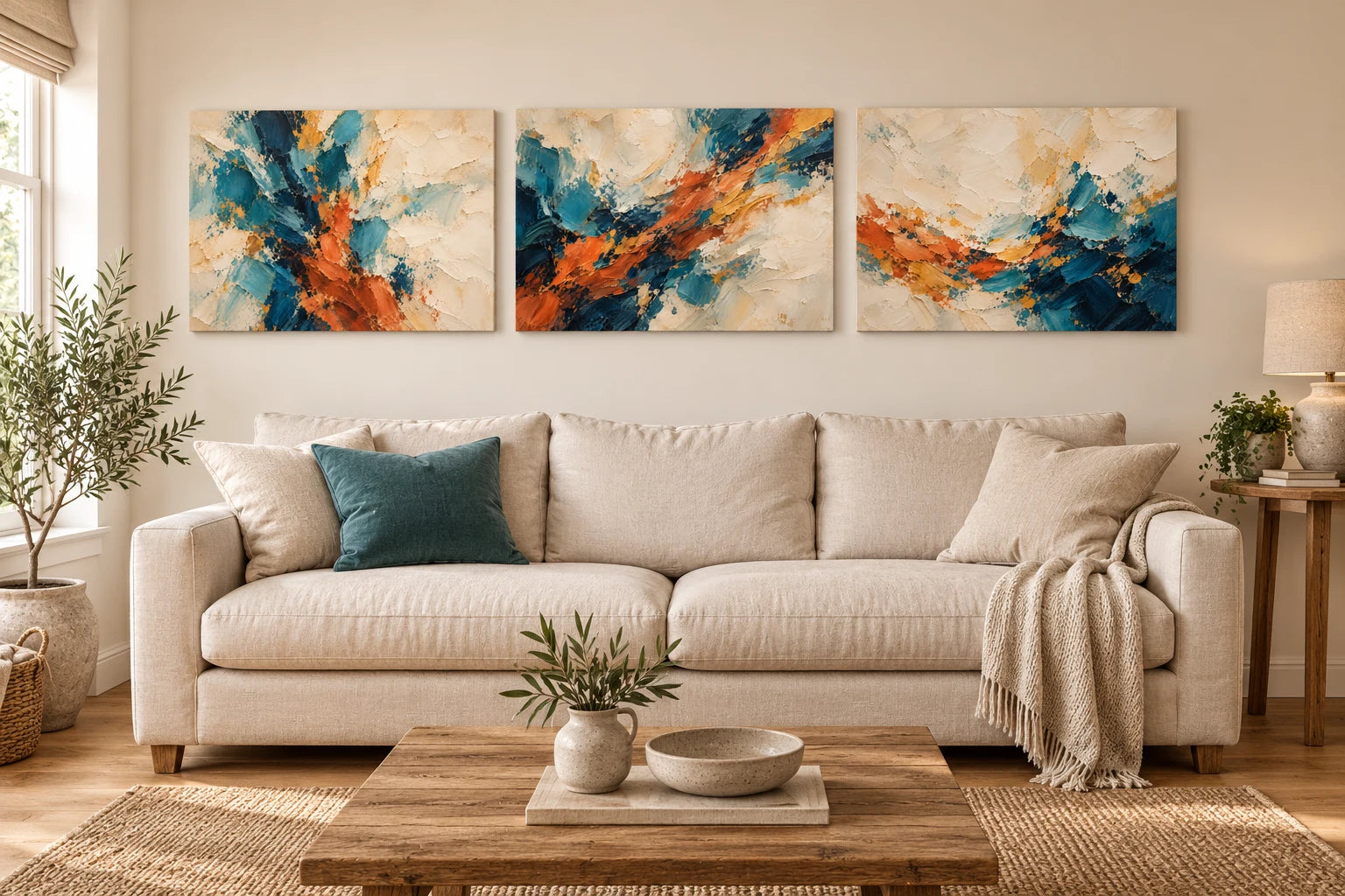
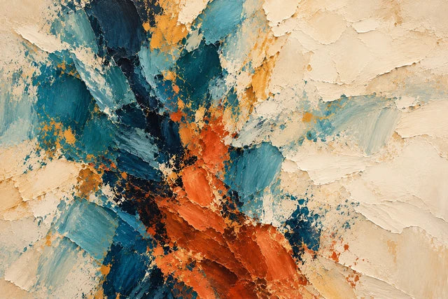
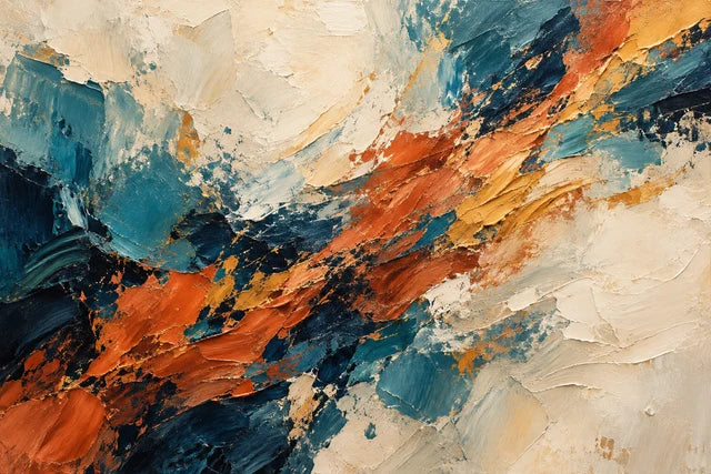
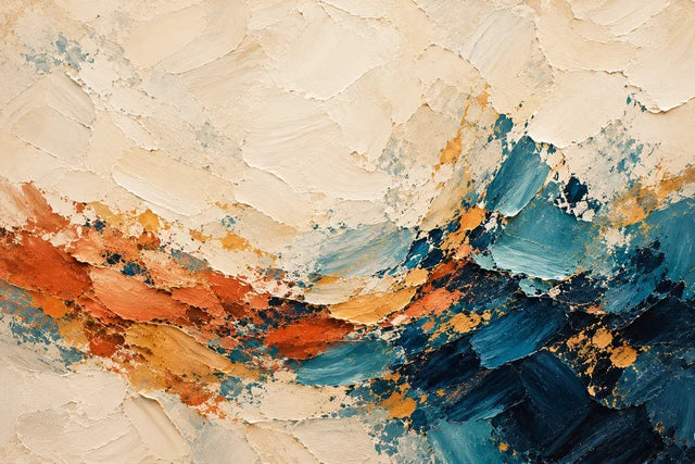
The left companion, original design and right companion share a palette while each keeps its own composition. Compare the standalone artworks below; the room view is a styling illustration, not a print master.
01 / COLOUR, MARKS & COMPOSITION
What will the finished canvas feel like?
A canvas print reproduces the colour and appearance of the artwork. You can see the pictured brushstrokes, paint ridges and tiny shadows, while the canvas itself has a woven surface. It does not have the physically raised paint of an original impasto painting. The paint shadows within the image are printed details; they do not move when the light in your room changes.
That distinction helps you choose the right finish. A print offers a practical way to enjoy a painterly composition, your own colour choices and a size that suits your wall. If you want actual sculpted paint you can feel, choose an original painting or a piece made with physical painting materials.
02 / COLOUR, MARKS & COMPOSITION
Four abstract styles to make your own
The examples are AI-created artworks. Their prompts describe techniques, colours and composition so you can develop a personal design. Image tools interpret prompts differently, so your result will vary.
AI-CREATED ARTWORK
Expressive colour and impasto
Deep teal, midnight blue, terracotta and ochre move across a warm ivory ground. Broad strokes and scraped passages create movement, while quieter areas give the colours space. This is a useful starting point if you want a confident focal piece without making the whole surface equally busy.
Try changing: the main colour, the direction of the strokes or the amount of quiet background.

AI-CREATED ARTWORK
Warm neutral texture
Ivory, sand, taupe and a little sage create a calmer arrangement. The interest comes from overlapping paint passages, small charcoal interruptions and the appearance of knife ridges. Keep the pale colours distinct so the detail does not disappear into one flat beige area.
Try changing: the warmth of the neutrals, the sage accent or how much textured detail sits near the centre.

AI-CREATED ARTWORK
Monochrome gestures
Strong black and charcoal marks contrast with an ivory painted ground. A few broad gestures can be more effective than many small marks. Different greys, broken edges and visible bristle tracks keep the dark passages from becoming a solid black patch.
Try changing: the balance of black and ivory, the size of the main stroke or the softness of the grey passages.

AI-CREATED ARTWORK
Layered colour blocks
Rose, aubergine, blue and coral form irregular painted blocks. Scraped edges and overlapping pigment keep the design painterly. It is a way to enjoy colour without needing a recognisable subject, and you can adapt the palette to a room or favourite collection of colours.
Try changing: two main colours, the size of the blocks or where the strongest accent sits.
03 / COLOUR, MARKS & COMPOSITION
Build a prompt around five clear choices
You do not need to know every painting term. Begin with the choices that will make the biggest difference to the result.
| Choice | What to describe | Example |
|---|---|---|
| Palette | A background, two main colours and one or two accents | Warm ivory, petrol teal, midnight blue and small terracotta accents |
| Marks | The type and scale of paint marks | Broad palette-knife strokes, broken edges and fine bristle tracks |
| Composition | Where the visual weight sits | An asymmetric cluster left of centre with quieter space on the right |
| Texture | How the pictured paint surface should look | Matt impasto ridges, scraped underlayers and subtle shallow shadows |
| Format | The shape of the artwork you want to print | Landscape 3:2, artwork only, with important marks away from the edges |
Use the editable prompt below to combine those choices. Start with a small palette and a clear arrangement, then refine the result once you can see it.
Choose your colours, mark-making and layout. Copy the prompt into an AI image tool you use; image generation happens in that tool.
04 / COLOUR, MARKS & COMPOSITION
What do impasto and palette-knife marks mean?
Impasto is the effect of thickly applied paint, with visible ridges and marks. A palette knife can spread, scrape and build paint into irregular passages. Brushstrokes can show the sweep of a brush and the tracks left by its bristles. Thin layers let some of an earlier colour show through; scraped areas expose parts of what is underneath.
In an AI prompt, these terms describe the appearance you want the image to suggest. Liquitex's guide to creating texture explains how painters use thicker paint, gels and pastes for actual physical texture. Our examples use generated images to suggest that appearance in a print. [1]
05 / COLOUR, MARKS & COMPOSITION
Create and refine your artwork, step by step
1. Decide where it will hang
Measure the available wall and look at the room in normal daylight. Choose a landscape, portrait or square composition before generating. A wide design above a sofa needs a different arrangement from a portrait piece beside a doorway. A digital room preview can help you imagine colour, but your own measurements determine the fit.
2. Pick a palette with a clear hierarchy
Choose a dominant background, two main colours and a small accent. You might take a teal from a cushion or a warm neutral from the room's wood and fabrics. The colours can complement the room without matching every object. If you use a reference photograph of the room, describe which colours to borrow and ask for artwork alone.
3. Generate a few options
Use one of the prompts or the builder. Ask for the complete artwork to fill the image, without a room, frame, signature or border. Compare the results at a small size first: the overall arrangement should work before you spend time on fine detail.
4. Inspect the paint detail
Zoom in. Look for varied marks, believable overlapping layers and controlled texture. Check for smeared detail, repeated patterns, invented lettering or a surface that resembles inflated plastic. More texture is not always better; broad quiet areas can make the detailed passages more convincing.
5. Change one thing at a time
Keep a version you like before asking for an edit. Specify what should stay: the composition, palette, contrast or mark scale. Then make one change. For example, reduce the terracotta, soften the blacks or create a quieter upper area. You can compare each edit with the previous version instead of losing track of the design.
6. Save the best original file
Download the highest-resolution version available from your image tool. Keep the original download and a copy of the prompt. A screenshot of the artwork usually gives you less useful detail and may include interface elements. Save each member of a set separately with a clear filename.
7. Preview it at the size you will order
Upload the file, choose your dimensions and check the crop and canvas sides or poster fit. Inspect the artwork at the proposed print size. If fine paint detail looks soft or artificial, refine the source image or consider a smaller print before ordering.
06 / COLOUR, MARKS & COMPOSITION
Useful refinement prompts
Keep the artwork you like as the reference for each edit. These instructions are deliberately focused so you can see what each change does.
Make the pictured paint more convincing
Attach the artwork you want to refine in your image tool.
Calm down a busy result
Attach the artwork you want to refine in your image tool.
Adapt the palette to your room
Attach the artwork you want to refine in your image tool.
Create a different orientation
Attach the artwork you want to refine in your image tool.
07 / COLOUR, MARKS & COMPOSITION
Make a pair or a coordinated trio
A set works when the pieces share a visual language while each composition has something of its own. Keep the palette, paint technique, contrast and aspect ratio consistent. Change the arrangement, direction of movement or position of the strongest colour.
Our expressive example has two separate companions: one concentrates the colour in a loose vertical cluster, while the other gives more space to the upper area. They were generated as complete artworks using the first piece as a style and palette reference. They are not three slices of one image.


Three separate AI-created artworks sharing a palette and painterly technique.
Attach your first artwork when your image tool supports references. Tell it to carry over the colours and mark-making, then describe a clearly different composition. For a pair, start with the original and the companion you like best. For a trio, make a second companion with a complementary arrangement.
Attach your first artwork or the indicated example as the style reference in your image tool. Open the first artwork to save as your reference.
Attach your first artwork or the indicated example as the style reference in your image tool. Open the first artwork to save as your reference.
Measure the whole arrangement
Add each print's width and every gap. Three landscape A4 canvas fronts are 29.7 cm wide each. With two gaps of 5 cm, the arrangement is 99.1 cm wide. Three landscape A3 fronts with the same gaps take 136 cm. These are layout examples; choose gaps and sizes to suit your own wall. For framed posters, use the frame's outside width when planning the arrangement.
08 / COLOUR, MARKS & COMPOSITION
Why can an original abstract painting cost thousands?
The price of an original painting can reflect the artist's time, materials, experience, exhibition history and costs of selling the work. Artfinder's seller guidance starts with an hourly rate, time spent and materials, then considers similar works and the artist's career. [2]
The wider art market also considers authorship, provenance, condition, rarity and comparable sales. Sotheby's lists these among the factors used to estimate a work. A retail asking price alone does not prove that a painting sold for that amount. [3]
An AI-created print offers another way to decorate your home: you shape a personal composition and pay for producing a print. It does not carry the same physical paint surface, artist history or collectible status as an original painting. Its appeal can come from how well you choose the colours, balance the design and fit it to the room.
09 / COLOUR, MARKS & COMPOSITION
How to create a considered result on a budget
Spend time on the image before increasing the print size. A balanced composition, a clear palette and a good source file make more difference than adding every possible effect. Check a set together before ordering so one piece does not feel much darker or busier than the others.
Choose the finish around your budget. A canvas has a stretched edge and woven surface. A poster is an unframed paper print, so include a frame and any mount in your budget if you want that presentation. AI tool charges, optional print upgrades and any framing costs are separate from the print price.
For a starting comparison, an A3 canvas is £27.99 and an A3 poster is £11.99 at the prices checked on 11 October 2026. Under the current 3 for 2 offer, three equal-priced A3 canvases have a base total of £55.98; three equal-priced A3 posters have a base total of £23.98. These examples include VAT and standard UK delivery for those sizes. Optional upgrades are extra, and posters are supplied unframed. Check current prices and the creator's final total before ordering. [4]
10 / COLOUR, MARKS & COMPOSITION
Canvas or poster for painterly abstract artwork?
| Format | What you see and feel | What to check |
|---|---|---|
| Stretched canvas | The pictured paint detail on a woven canvas surface, with a visible stretched edge | Front crop, canvas depth, side treatment and hanging options |
| Poster print | The artwork on smooth matt paper, supplied unframed | Paper size, frame fit, mount opening and total framed size |
YI2C canvas prints use poly-cotton canvas stretched over solid pine. Slim and Chunky depths give a different side profile; the creator shows which finishes are available for your chosen size. Poster prints use 230gsm matt paper. Neither format adds raised paint to the generated artwork. [5] [6]
For an unframed canvas, the selected width and height describe the outside front dimensions of the stretched canvas. Depth describes how far it projects from the wall. An optional floating frame increases the total outside size. For a poster, the selected dimensions describe the paper; a mount and frame change the visible opening and overall wall space.
11 / COLOUR, MARKS & COMPOSITION
Check resolution, proportions and edges before printing
Pixel dimensions matter
Look at the actual width and height of the downloaded image in pixels. A file labelled 300 DPI does not gain extra picture detail simply because that number changes. Adobe distinguishes changing print resolution from resampling the image's pixels. [7]
For a mathematical example, a 6000 × 4000 pixel image printed at 60 × 40 cm gives approximately 254 pixels per inch before cropping or wrap requirements. A 1536 × 1024 image at the same size gives about 65 pixels per inch. These are comparisons, not print-quality guarantees. The source detail, chosen finish, crop and viewing distance also matter.
The examples on this page demonstrate design and prompts. Judge your own final downloaded file at the size you want. Upscaling may help with output dimensions, but it can also invent or distort the fine paint marks. Check the result closely rather than relying on a larger pixel count alone.
Match the artwork's shape to the print
Our examples use landscape 3:2 proportions. A-series paper has a different shape: an A3 landscape sheet is 42 × 29.7 cm. A 3:2 image may need a crop to fill it. Choose compatible custom dimensions within the creator's supported range, regenerate for another proportion or preview a deliberate crop. Do not stretch the artwork to fit.
Check what happens at the canvas edge
Leave room around important marks. Gallery wrap carries part of the picture around the sides. Mirror sides or a suitable plain side treatment can preserve more of the front composition, where offered. Use the creator's preview to inspect the front and all edges; the amount needed depends on the selected finish.
12 / COLOUR, MARKS & COMPOSITION
Questions about making your own abstract art
Can I make abstract art without painting experience?
Yes. Start with a limited palette, one type of mark and a clear arrangement. You can learn by comparing results and changing one choice at a time. You do not need to describe every technical detail in the first prompt.
Can I choose colours to match my room?
Yes. Name a few colours or supply a reference image you can use. Describe which colours to borrow and whether you want a warm, cool, bold or quiet result. Check the final image in normal daylight as well as on your screen.
Will the print have thick paint I can touch?
It will reproduce the appearance of paint texture. The canvas has its own woven texture, but the printed image does not become physically raised oil or acrylic paint. A poster reproduces the image on smooth matt paper.
How do I avoid a cheap-looking digital effect?
Ask for varied marks, matt pigment, believable layering and some quieter passages. Reduce plastic-looking relief, uniform swirls, excessive shine and repeated detail. Inspect the artwork closely before choosing a print size.
Can I make a large abstract canvas?
You can choose larger supported dimensions in the creator, but the final file must suit them. Check its actual pixels, detail and crop. If the source looks soft or artificial at the proposed size, improve the file or choose a smaller print.
Can I make a matching pair or three-piece set?
Yes. Use the first artwork as a reference, keep its palette and mark-making, and ask for separate new compositions. Match the aspect ratios and review the images side by side before printing.
Is a matching trio the same as a triptych?
A coordinated trio contains three related artworks. A split-image triptych divides one composition across three panels and needs planning for the panel crops and gaps. The examples here are three separate complete artworks.
Should I choose canvas or a framed poster?
Choose canvas if you like a woven surface and stretched edge. Choose a poster if you want smooth paper and a frame or mount of your own. Compare the full cost, including any frame, and measure the total wall space each presentation occupies.
Will the colours look exactly like my screen?
Screens emit light and prints reflect it, so the appearance can differ. Screen settings and the room's lighting also affect colour. Check the image without extreme screen brightness and avoid making essential detail depend on almost-black shades.
Will the same prompt always make the same artwork?
Usually not. Results depend on the tool, its settings and how it interprets the prompt. Save the image you like and use it as a reference for refinements when that option is available.
Can I add real paint to a canvas print afterwards?
A printed canvas is not automatically suitable for painting over. Compatibility depends on the print surface and materials. Ask about the product before using paint, gel or varnish, and test your chosen materials on a suitable separate sample.
Is AI-created abstract art the same as buying an original painting?
It is a different way to create an image for your home. You can make personal choices about colour and composition, while the finished product is a print. An original painting also has the artist's physical work, materials and history.
Can I use the prompts in any AI image tool?
The wording is designed to be adaptable. Check whether your tool supports reference images, aspect ratios and the download quality you need. Tool charges and permitted uses depend on the service you choose.
13 / COLOUR, MARKS & COMPOSITION
Turn your favourite version into a print
Save the original file, choose your dimensions and preview the crop. If you are making a set, check all the pieces together before ordering. We can help you assess the file and work out the most suitable size and finish.
 Create your own gaming-room wall art with AI →